Turns Out, Judgment Doesn't Batch Well
Last week I wrote about turning two assignments over to AI to see whether it could functionally grade for me. So, this week I did it again! Same two classes. Same basic experiment. Very different results.
One assignment took about 45 minutes from the beginning of the conversation to finished grades.
The other one ate my entire week.
The short version is that the more procedural assignment went great. The visual design assignment became a complicated mess of model changes, recalibration, drifting feedback, manual corrections, audio notes, grade adjustments, transcripts, and me eventually asking the AI what the hell had happened.
I don’t know what all of this means yet; that’s still not the point of these posts. We’re somewhere around week four or five of a sixteen-week semester. I’m documenting what worked, what didn’t, what surprised me, and what I want to try next.
The Straightforward One
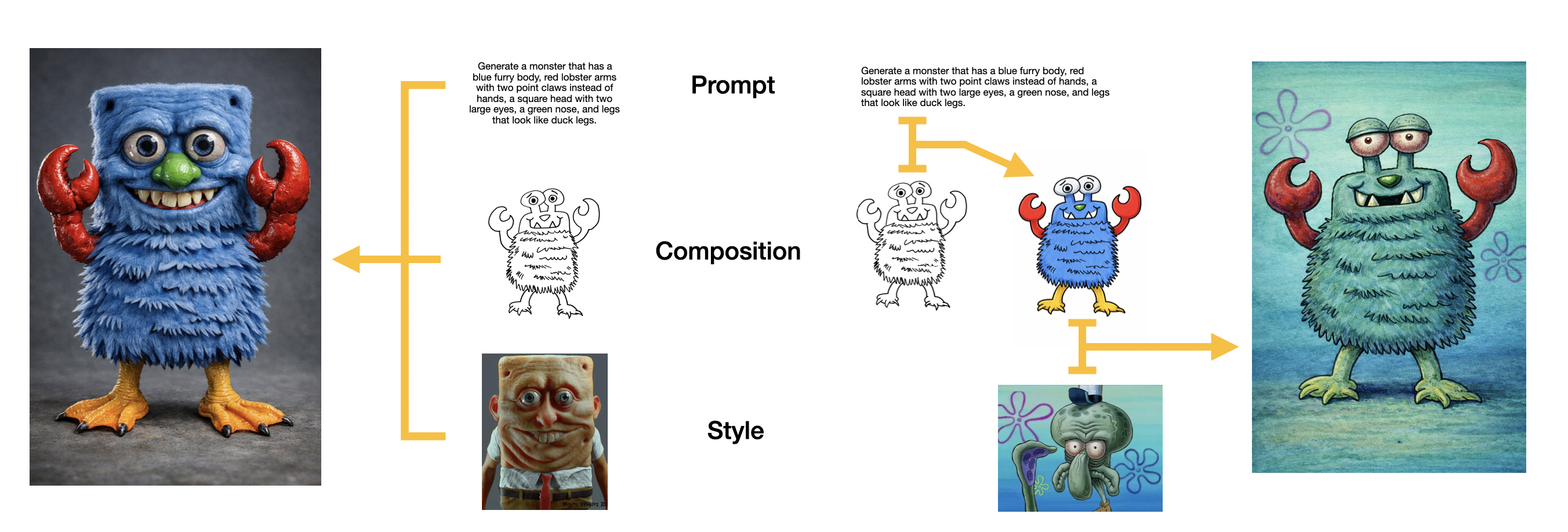
The generative AI assignment was called Exploring Influence. Students were looking at the relationship between three things in Adobe Firefly: a written prompt, a composition reference, and a style reference. This wasn’t an assignment about whether the final image was beautiful. I was looking at process. Did the student understand what each influence was doing? Could they show how changing one part affected the result? Could they explain what happened?
That made the grading relatively straightforward. There were 24 students in the class, 19 submitted assignments, and five pending submissions. From the first conversation about the assignment through calibration and completed grading, the process took about 45 minutes. Crazy fast. Loved it.
The AI did point out a problem; several students had treated the assignment as an additive sequence:
- Prompt only
- Prompt plus composition
- Prompt plus composition plus style
What I had intended was for all three influences to appear in every experiment, with the student changing which one took priority.
The additive interpretation was wrong according to the assignment, but it also made complete sense based on how I had taught the lesson. The in-class monster activity introduced each influence one at a time. The written assignment said all three should be used, but some of the surrounding language made the reference images sound optional. The lecture demonstrated accumulation. The homework expected prioritization. Students had to understand that those were two different experiments, and a lot of them didn’t.
My first reaction was basically: Oh, it’s missing something. Then once the AI surfaced the repeated problem, I could look across the class and see the pattern. That didn’t feel like widespread student noncompliance. It felt like mixed signals.
I recalibrated the grades. If a student followed the additive structure but clearly understood what the influences were doing, I wasn’t going to punish them heavily for a misunderstanding that I’d helped create. If they did the wrong experiment and didn’t demonstrate the thinking, that was different. The thought process still mattered.
That’s also why I don’t want a grading system that collapses everything into one overall impression. A student could complete the wrong experimental structure and still write a reflection that showed real understanding. Completion and process could take a hit without pretending that the reflection taught me nothing.
The grading also gave me a useful revision for the next version of the assignment. Firefly 3 is unusually good at separating prompt, composition, and style into visible controls. That makes it a great teaching environment, but it isn’t how every current image model works. In GPT, the prompt, uploaded images, conversation, and implied intention are all being interpreted together. So the next version may use Firefly as the controlled classroom demo and GPT as the main lab tool to experiment with.
But that’s exactly the kind of thing I want from this larger grading experiment. The AI points out a repeated problem. I figure out whether the problem belongs to the students, the assignment, the teaching, or some combination of all three. Then I’ve got better context for the next time I teach it.
Success!
Then Came Pattern Library
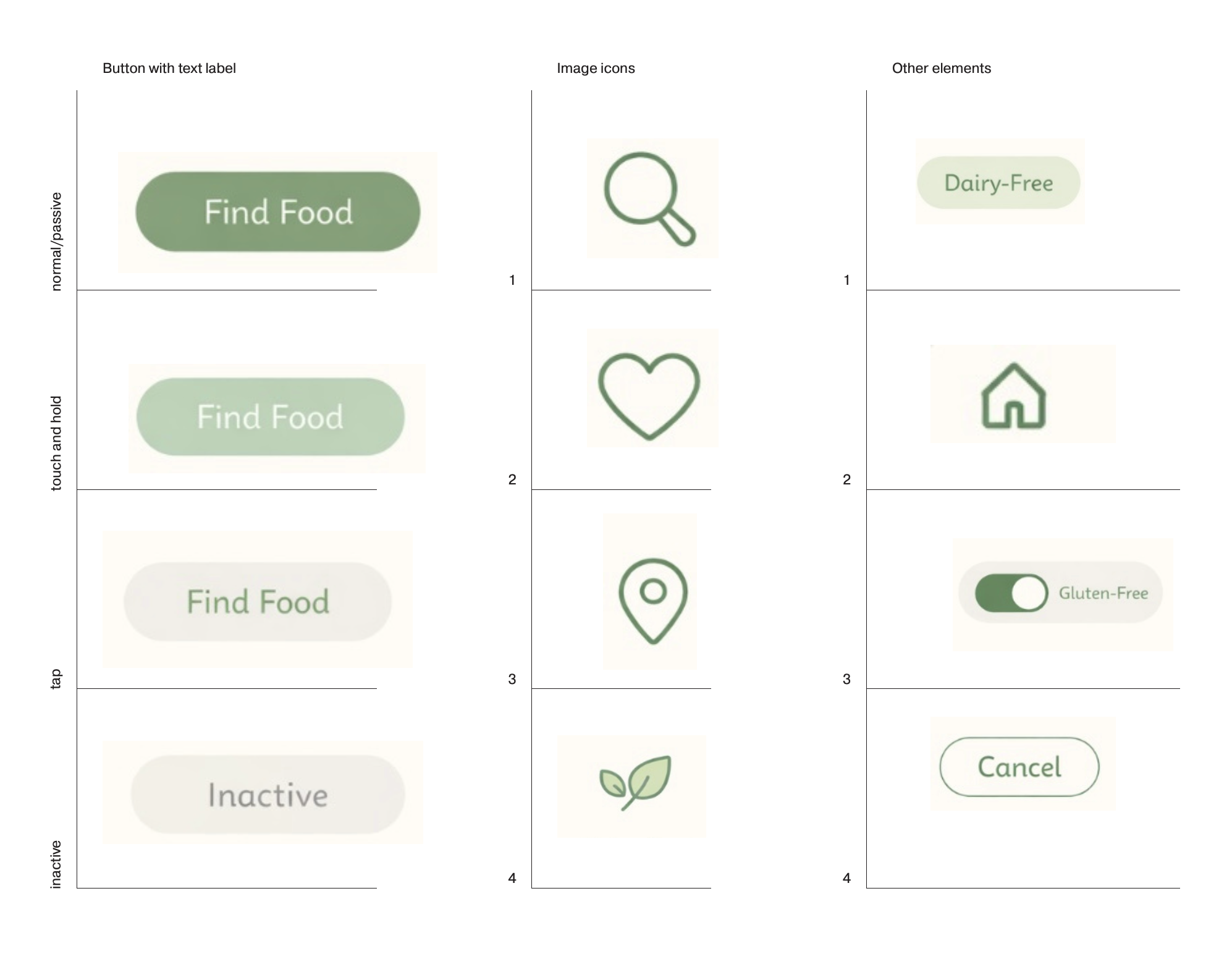
Pattern Library is part of the first large project in my UI/UX course. Students begin with a specific app concept and audience, create a mood board, and then translate that direction into a small interface system. They got to make:
- A text button in four states
- Four primarily image-based icons
- Four other interface elements
They are dealing with communication, button hierarchy, scale, typography, icon families, audience specificity, construction systems, functional subgroups, and whether any of this stuff would survive at the size it might actually appear on a phone.
With between 35-40 students in this class every semester, I know this assignment takes about four hours to grade.
I knew the AI setup would add time on the first pass. The Moodboard assignment had already taught me that. I spent somewhere around an hour to an hour and a half calibrating Pattern Library. I explained the assignment, clarified the button-state model, walked through the lecture concepts, reviewed strong examples, described what I was looking for in icon families, and gave the AI four transcripts of feedback I had recorded for students in previous classes.
I wanted it to understand not just the rubric, but how I actually talk about this work.
Here is one of the audio transcripts I gave it. The student’s name and app title have been removed, but the transcript is otherwise left rough because the roughness is part of how I give feedback.
Scroll to read the full transcript ↓
All right, [student], let's talk about your pattern library for [app]. First things first, your PDF is not formatted correctly in the right order. You want to make sure it's doing that and everything is the right size and dimensions.
Right now, your three pages are three different sizes with the middle one being a different alignment. It's vertically aligned as opposed to horizontally aligned. Please fix that.
Now, looking at your pattern library, it does have a nice connective thread through the mood board. And overall, this is really nice. It is really generic, but what I'm hoping is that when you move into the interface, the imagery and style that you're gonna be doing will be doing a lot of the heavy lifting to connect with your specific audience through images.
That really works well balanced out against very clean, simple, you know, not super stylized icons like what you have. The buttons or the text labels work great. The coloring works great.
I think you found a nice solution for the tap for fine food here. And yeah, I don't really have any other notes other than these should be labeled. So I know what they are.
Like, I don't know what that leaf icon is. It is the only one that is filled in. So I'm curious as to why the leaf is filled in.
Is there a specific reason? I don't, I don't know. So, yeah, those are really notes. Good work.
I gave it four examples. Together, they gave the AI a sense of the pattern I tend to use: start with what’s working, identify the consequential problem, point to the exact visual evidence, explain why it matters, give the student a way forward, and end in a place that says, You can do this…. Yes, it’s basically a shit sandwich, but hopefully a tasty one.
Then we graded one student together.
The result was incredible.
I mean that literally. I went and grabbed a couple of my design colleagues and said, Holy shit, read this. Look at what it’s noticing. It caught scaling issues, thin strokes inside a typeface, the relationship between drop shadows and button states, differences in outline weight, and inconsistencies in the way the icons were constructed.
It sounded like me. It noticed things I hadn’t explicitly told it to notice. You could definitely read this and be either excited or terrified about the possibility, depending on where you already sit with AI.
Here is the full critique. Again, the student’s name and app title have been removed.
All right, [student], let's talk about your pattern library. First, I know you had trouble getting everything into one PDF, and you're going to ask about that in class. You do have all three parts here, so we can get them combined and put in the correct order. Read the full critiqueCollapse critique
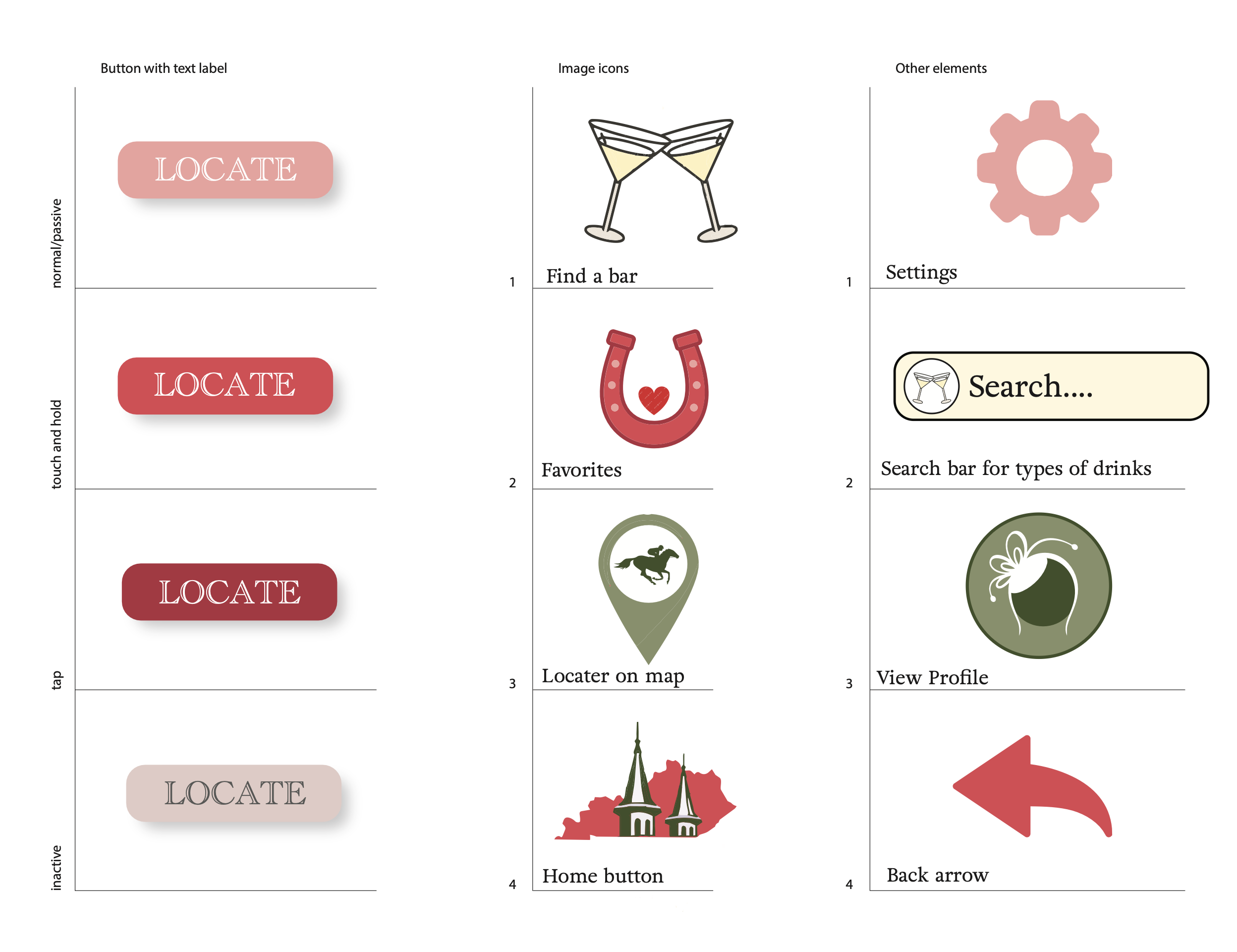
All right, [student], let's talk about your pattern library. First, I know you had trouble getting everything into one PDF, and you're going to ask about that in class. You do have all three parts here, so we can get them combined and put in the correct order. That's an organization issue we can fix. It's not really an issue with the design itself.
The strongest thing about this is how clearly it connects to your audience. The martini glasses, horseshoe, horse, regional-event shape, and pink, red, cream, and olive colors make sense for the intended weekend audience. It doesn't feel like these are generic icons that could have been made for any map app. They feel specific to the place, event, drinks, and the kind of audience you described.
Your four Locate buttons are clear as four different states. The normal button reads as regular, the touch-and-hold becomes brighter and more saturated, the tap becomes darker and has the strongest contrast, and the inactive button fades back. I can tell which one is active and which one is unavailable, so the basic interaction is working.
The main thing I would watch with the buttons is the outlined type. It looks elegant at this size, but the strokes inside the letters are very thin. If this button gets smaller on a phone, parts of those letters may start to disappear. You could fill the letters or use a slightly heavier version of this serif typeface. I would also make the touch-and-hold feel physically pressed by reducing or tightening the drop shadow, because right now the color changes, but the button still appears to float at about the same height.
The ideas behind your image icons are really good. The crossed martini glasses clearly mean finding a bar. The horseshoe with the heart is a clever favorite icon. The horse inside the map marker connects the location function to the event. Using the regional landmark for the home button is also specific to this app instead of using another completely generic house.
Where I think you need another pass is in how those icons are constructed. The martini glasses use thin dark outlines and pale fills. The horseshoe has a much heavier pink outline and feels more like a bold cartoon symbol. The map marker is mostly a flat olive shape with a tiny horse silhouette inside it. Then the home button becomes a much more detailed illustration with the state shape, buildings, towers, and several colors. Pick a rule for how these are drawn and apply it to each one. Maybe everything uses the same dark outline, the same stroke width, and one flat color plus one accent color. Or maybe everything is built as a flat silhouette with no outline. Either direction could work.
The same issue appears in the other-elements column. The settings gear and back arrow are simple flat pink shapes. The search bar has a heavy dark outline and a detailed martini illustration. The profile icon is a circular badge with several colors and a decorative white shape. Again, none of those ideas is automatically wrong, but they are following different construction rules. Simplify the profile shape and decide whether the search-bar outline belongs throughout the system.
Overall, the ideas are strong, the audience connection is strong, and the button states are working. Your next step isn't to invent different icons. It's to redraw these good ideas using one repeatable visual formula and check whether each icon is still clear when it is much smaller.
At that moment, I thought we had it.
(Narrator VO) They didn’t.
Luna, Sol, and the Grading That Wouldn’t End
The expensive reasoning and calibration work had been done with Sol. I then handed the grading plan to Luna, the faster and less expensive model, to complete the more mechanical class pass.
Luna graded two students as a test. Those critiques were good. They were slightly shorter, but I had also told it to stop listing every single thing the student had done correctly and use more of the feedback for actual critique.
Within the next two or three students I could tell it wasn’t working. The feedback became more generic. It repeated the contents of the mood board. It used similar advice across different students. It started mentioning details that weren’t in the work. The sharpness of that first critique was gone.
My first assumption was that this was a model problem. Luna is more mechanical. Sol reasons more. Maybe visual design critique simply required the more expensive model.
The university is paying for the credits, so I figured, screw it. Let’s test it truthfully.
I switched back to Sol and asked it to re-review the class.
As expected, Sol was better. It noticed more exact shapes, compared elements that would actually appear together, and made different judgments about cohesion, scale, button hierarchy, and communication. It changed a meaningful number of Luna’s scores.
But then Sol drifted too.
The confusing part was that it didn’t drift in a clean line. The critiques got worse in the middle, then became useful again a few students later. I couldn’t make sense of it while I was grading. I was in a faculty meeting when I started seeing claims about visual details that weren’t there, so I just began rewriting the critiques myself. I still read every AI response. Partly because I could sometimes use it, but also because the whole point of this experiment is to find out whether AI is capable of doing this. If I stopped reading as soon as it became inconvenient, I wouldn’t learn much.
So I kept the student’s work open beside the AI critique and checked every statement against the page. I never trusted the critique enough to accept it without looking. The AI was still my misguided first-semester teaching assistant. I was just standing over its shoulder close enough to get HR involved.
By the time I finished, something that normally takes me about four hours had taken closer to eight. It stretched across several days and felt like the grading would never end.
This time, my TA-AI (TAI?) saved me nothing.
The Batch Was the Problem
I didn’t understand what had happened until after I’d recorded the audio note feedback and the grades were posted. So I went back to Sol and asked it to help me audit the process; what the heck happened?
The model hadn’t been treating each student as a complete grading task. It appears to have visually reviewed all 29 students first, then written the critiques later in six batches. The visual pass itself took roughly eight minutes.
That meant the exact page wasn’t necessarily present when the critique was written. The model still knew the assignment. It knew the rubric. It knew what a Pattern Library critique was supposed to sound like. What it no longer had as clearly was the exact evidence from that specific student’s page.
So it filled the gap with plausible design criticism. That’s how you get a polished note about a shadow that isn’t there, a caption or label treated as interface typography, or a recommendation that every custom location symbol become a standard map pin.
The language still sounds professional. The evidence underneath it has gone soft.
This helped explain something I’d seen in previous semesters. Before Codex, I had tested grading complex assignments in regular ChatGPT by uploading a few submissions at a time. Every six or seven students, I’d have to re-prompt and recalibrate because the responses began to drift. I knew the drift existed, I just accepted it as GPT just not being that good yet. I didn’t understand as much about the workflow creating it.
The weird part is that batch processing can be amazing for other kinds of work. I’ve used Codex to update around 40 archival webpages at once. It opened zip files, copied images, renamed them, matched them with the right pages, changed HTML and CSS, moved everything into the working sandbox, checked the result, and archived the originals. It finished in about ten minutes, and the work was perfect.
That was a complicated, multi-step process just like the Pattern Library task, so it had to be something else.
The difference seems to be judgment. Updating the websites had complicated but verifiable steps. Pattern Library required the model to decide what mattered most about each student’s work, how severe the issue was, and what that beginner most needed to hear next.
Doing every webpage operation in one giant batch worked. Looking at every design in one giant batch and writing the judgment later didn't.
The Same Critique Could Change the Grade in Either Direction
The audit also corrected something I initially misunderstood about my own review. I didn’t simply preserve Sol’s scores and rewrite the feedback; I changed 21 of the 38 grades. Of the original 36 submissions, 19 changed and 17 stayed the same. Both late submissions changed too. Eleven grades increased and ten decreased. The adjustments ranged from three points lower to five points higher.
That’s almost perfectly split. I wasn’t consistently being kinder or harsher than the AI.
The difference was how we classified the severity of a problem. I raised grades when the AI had misread the visual evidence, overprescribed a conventional solution, or treated a beginner-level refinement as a system failure. I lowered grades when the AI had praised the broad visual cohesion but missed a more consequential problem with scale, interaction states, or elements that needed to function together.
Sometimes we agreed about the problem and disagreed about what that problem should cost a beginner making their first Pattern Library.
Here is an example where the AI treated a working state system as a major failure. I raised this grade by five points.
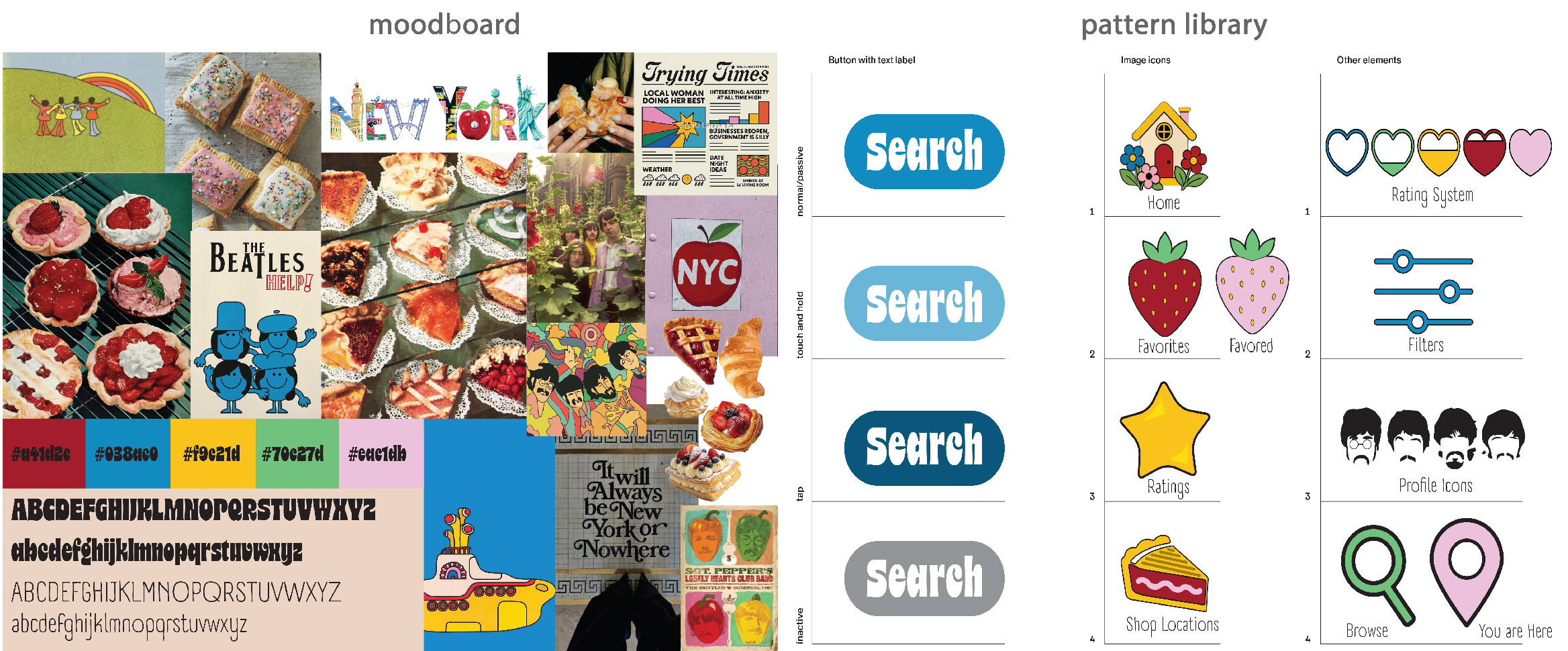
All right, [student], let's talk about your pattern library. The red, pink, strawberry, and dessert direction is present, and the gray rounded utility controls work as a clear subgroup. The bigger issues are the scale of the button and whether the image icons communicate their exact function without the labels. Read the full comparisonCollapse comparison
Original AI critique
All right, [student], let’s talk about your pattern library. The red, pink, strawberry, and dessert direction is present, and the gray rounded utility controls work as a clear subgroup. The bigger issues are the scale of the button and whether the image icons communicate their exact function without the labels.
The
gobutton is very small, and the pale tap version is the quietest of the three usable states. The darker touch-and-hold version catches the eye first, so the state hierarchy feels reversed. Enlarge the button and the word, make touch and hold a darker pressed version of normal, and use the strongest red or pink contrast for tap. Inactive can stay gray, but lowering the type contrast would make it feel less available.The heart and location pin use culturally familiar silhouettes, so favorites and user location read quickly. The strawberry does not communicate
dessert finderby itself. It could mean strawberry flavor, ingredient, product, or category. Combine it with the same location pin or a small magnifier so the action becomes specific. The rating line also needs larger markers and a clearer five-step structure if it will be touched or read on a phone.The utility group is visually more consistent than the image group because cancel, search, profile, and home all use gray rounded squares with pale interior shapes. Use that repeatable container idea for the red and pink icons, or at least give the heart, strawberry, pin, and rating the same outline weight and amount of white space. That would keep the flat interface restrained while carrying more of the mood board’s personality through color and one repeated dessert cue.
My final audio feedback
All right, [student], let’s talk about your pattern library. It’s nice and improved specificity there, by the way. I think the red, the pink, the strawberry, the dessert direction is nice and present. And the kind of gray rounded utility controls, they work as a clear subgroup. The bigger issue may not, I guess it might be that the scale of the buttons and whether the image icons communicate their exact function really well.
I’ll start with that go button. It’s not visually centered. This is due to the descender of the G, that lowercase part, or the little curly part of the bottom. The tight space, the button itself, the, you know, extending the button size here will help it visually be centered, but it’s tough to do lowercase stuff like that when you’re at what you’re doing.
The pale tap version is nice. I do like it. I think it works well. It’s got good high contrast. I think folks will notice it. I do worry that the Go inactive might need to be, just the letters might need to be a little less bright gray, tone it down a little bit. But overall I think it works.
The heart and the location pin use familiar silhouettes, so favorites and the user location, they read quickly. The strawberry is cute, it visually matches, but I worry that it doesn’t visually stand out compared to the other, like the user’s location, especially when they scale down. So is there a way to make the differences a little more prominent while they’re still feeling part of that same system?
So overall I think you did a really nice job. You just need to make a few tweaks.
The AI saw a reversed hierarchy that needed a larger reconstruction. I saw a state system that basically worked and needed a few contained refinements. That changed the grade.
The mismatch also went in the other direction. Here is one where the AI praised the broader system and treated the remaining problems as refinements. My audio feedback identified several functional subgroups that broke apart when the related elements were viewed together. I lowered this grade by three points.
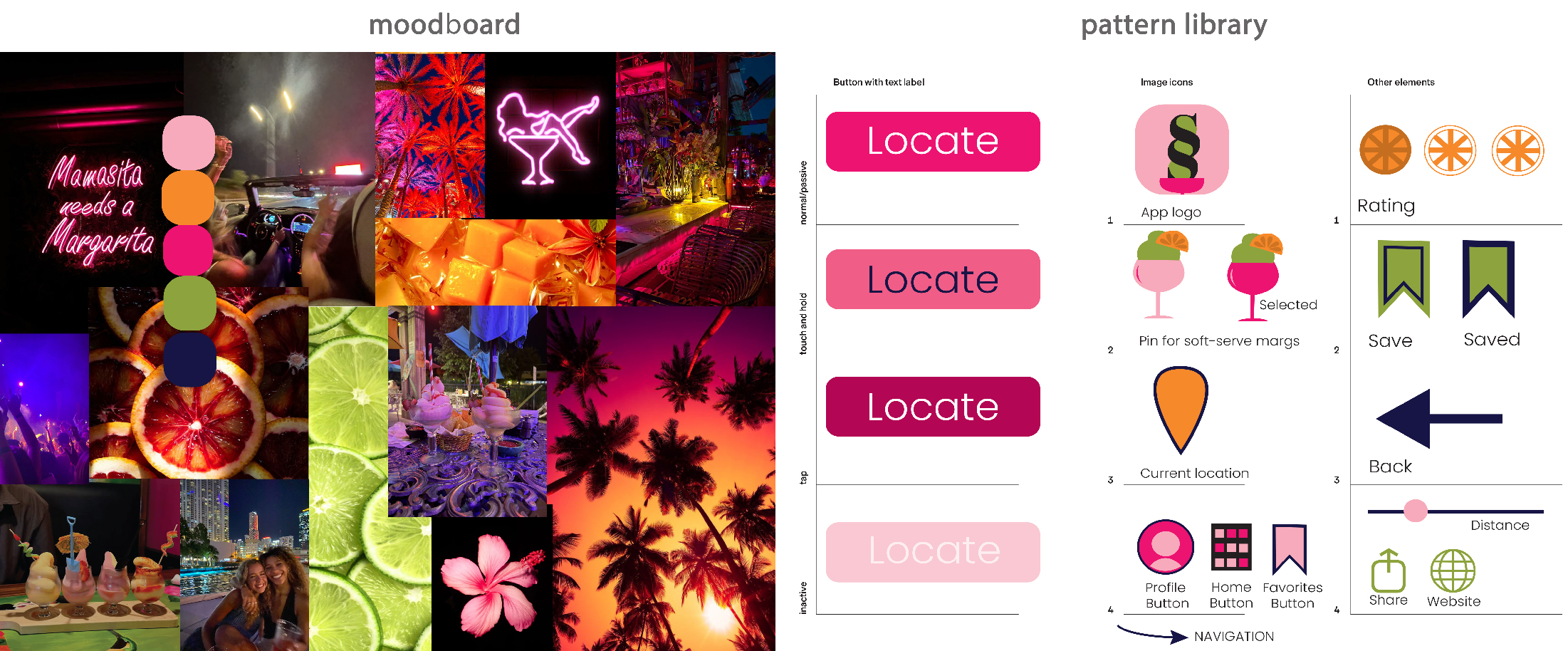
All right, [student], let's talk about your pattern library. This is a strong translation of the mood board because the neon pink, citrus orange, green, navy, and soft-serve margarita shapes are doing functional work. The venue states, save states, rating slices, and navigation group show that you're thinking in small systems. Read the full comparisonCollapse comparison
Original AI critique
All right, [student], let’s talk about your pattern library. This is a strong translation of the mood board because the neon pink, citrus orange, green, navy, and soft-serve margarita shapes are doing functional work. The venue states, save states, rating slices, and navigation group show that you are thinking in small systems instead of treating each row as a separate illustration.
The Locate states work. Tap is the deepest magenta and reads as selected, touch and hold changes value without overtaking it, and inactive recedes. You could tighten the touch-and-hold shadow slightly to make it feel pressed, but the visual hierarchy is already clear and the type remains readable.
The soft-serve margarita venue marker is memorable, but it does not use the familiar outer silhouette of a map pin. The plain orange current-location pin nearby makes that difference especially visible. Keep the glass, but place it inside a simplified pin or add a small pointed base so the user recognizes it as a location before learning the system. The selected and unselected versions should keep exactly the same silhouette and change only one or two properties.
The app logo, citrus rating, save and saved pair, and bottom navigation all stay within the same flat language. Test the small interior details in the app logo and navigation controls at actual phone size. Those are refinements, not a new direction. The broader system is already doing its job very well.
My final audio feedback
All right, [student], let’s talk about your Pattern Library. It’s a pretty strong translation of the mood board with all that neon pink, citrus orange, green, navy, soft-serve margarita shapes. It’s doing some good functional work. I like that you’re thinking about venue states, save states, rating states. I think that’s, you’re thinking in small systems instead of just treating each row as a separate, like, illustration thing. So I think that’s nice.
Your Locate button states, they work. It’s nice. Visual hierarchy here is pretty clear and the type remains very visible and readable. The soft-serve margarita venue marker, it is pretty darn readable. But one small thing is that since it doesn’t use a familiar shape of a common map icon, it’s not bad. It’s just you got to make sure that all that detail doesn’t get lost when it scales down.
The way you’re doing selections kind of varies across the board. The save, the margarita, the ratings, they all have tap states that have a different visual language. So you need to be consistent with those. Either make it a color change or stroke or fill versus no fill, but not all three. Choose a specific one for that.
The bottom navigation all have that nice little flat language, but the details are going to get lost when you scale those down. So you have to think about that.
Also your app logo, I think, is trying to just be too clever. It’s losing the idea. Plus, the margarita glass you’re using is different than the margarita glass that you would use in the pins that are going to be on the map. So not strong there. Your back arrow is super boring, just in relation to everything else. And your current location, that black stroke is not strong. You don’t have that type of black stroke really anywhere. And if the margaritas are going to be this fun margarita thing on the map, why wouldn’t your current location also be a fun thing? If you’re making your users understand the iconography you’re using, they’ll be able to understand themselves if you give them a different icon.
Neither comparison says that I’m always right and the AI is always wrong. We’re talking about subjective design grading. There’s no mathematically correct score waiting to be procedurally run through.
But it does show that score agreement isn’t enough. A useful design critique depends on identifying the right problem, deciding how much it matters, and explaining it in a way that helps this student make the next decision.
The Audio Was the Actual Feedback
The long AI paragraphs were never really the final product. I used them as scaffolds for audio feedback.
I like audio because it’s much faster for me than writing. Students also tend to engage with it. They can listen while looking at the work instead of trying to read a long paragraph and inspect a design at the same time. They hear the ums, the pauses, the changes in my voice, and the moments where I’m figuring something out while I talk.
It feels more like we’re sitting together in a critique. It’s also the human part of this process. The AI can help me organize what to notice, but the final thing the student hears is me.
At least for now… dun. dun. dun!
Because, of course, this has opened another completely different experiment. I regularly use ElevenLabs, and as part of the ongoing effort to build a localized GenAI pipeline I recently installed a voice-cloning system on my computer. So of course I started thinking… could the AI write an audio scaffold and then produce the note in my voice? Would that save the labor while preserving what students respond to? Would students find it useful, weird, deceptive, or completely unacceptable?
I don’t know. That’s a much bigger question about labor, disclosure, and whether using AI to write myself out of the process starts to resemble the people above me who might someday want to write me out of the process. And honestly the balance of how much AI is too much AI is still being figured out! But that’s not what this post is about. It’s just another branch this experiment created.
For this assignment, the transcripts of my audio recordings became useful after the fact. Once I had a written record of every audio note, I could compare what the AI noticed with what I actually told the students. That’s how I could see where the critique changed, where the grade changed, and what kinds of visual judgments the AI repeatedly missed.
What Changes Next Time
I don’t know yet whether Luna is incapable of this kind of visual grading. Its first two test critiques were good. The larger pass wasn’t. Sol was better, but Sol also drifted when it separated the visual review from the feedback writing. So the next test isn’t simply, Use Sol because Sol is better.
The next visual assignment needs to test the workflow:
- Keep one student’s files visible from inspection through scoring and feedback.
- Finish that student before opening the next one.
- Try Luna again under those conditions.
- Experiment with batches of one, two, three, or five to find where the drift begins.
- Stop when the critique names something that can’t be verified on the page.
- Stop when the same solution starts appearing for multiple students.
- Preserve the original AI draft, my edited version, and the final audio transcript as separate artifacts.
- Recalculate the grade ledger after every manual adjustment.
I also created a course wiki and an AGENTS.md file so the grading environment itself has durable context. The assignment standards, student-feedback voice, recurring problems, and workflow rules shouldn’t have to live inside one enormous temporary chat.
Maybe that makes the second semester dramatically better, like a teaching assistant returning to a course after learning it once.
Maybe it just gives me a more organized misguided TA.
We’ll find out!
For now, saying the AI graded this assignment is way too generous. It helped with grading. I also graded the AI, corrected it, changed 21 scores, rewrote critiques, recorded 38 audio notes, transcribed them, and audited the whole process afterward.
One assignment took about 45 minutes. One took over eight hours.
Two more experiments done. A whole lot more semester left.