Let's Design a Blog Together, Part 1
This is not really a post about a finished blog design magically appearing. It is more of a step-by-step look at how this thing took shape through AI image generation, Photoshop, CSS, Jekyll, GitHub, and a lot of small decisions that were probably too small to talk about individually, but together became the actual design.
I want to show the process because that’s the part I’m most interested in right now. Not just, here is the finished thing, isn’t that neat? I mean, hopefully it is neat. I like it. But the more useful part, at least for this fellowship and for how I think about teaching, is showing how it happened. I want the sketchy parts in there. I want the part where I made a quick Photoshop mockup. I want the part where the generated hand had the wrong number of fingers. I want the part where I didn’t understand why the CSS was not updating. I want the part where I asked the AI to do something, got something close, and then had to figure out what “close” actually meant.
So, let’s dive into the nitty-gritty details!
The first idea
First, I had the idea of a shadow puppet.
I wanted an image that could talk about a human and some kind of assisting force making something together. In the image, the human part is the hand. The assisting part is the light. The thing that appears is the shadow, a combination of the two inputs. And that felt like a nice metaphor for the theme of the whole blog. Here’s the first prompt I started with:
Prompt: "So my idea is to have a shadow puppet. You have, like, hands that form a shape and then the cast shadow is something specific shape that is realistic to the animal the hands make. I want it to be a flat cartoon style, something almost Mary Blair-esque."
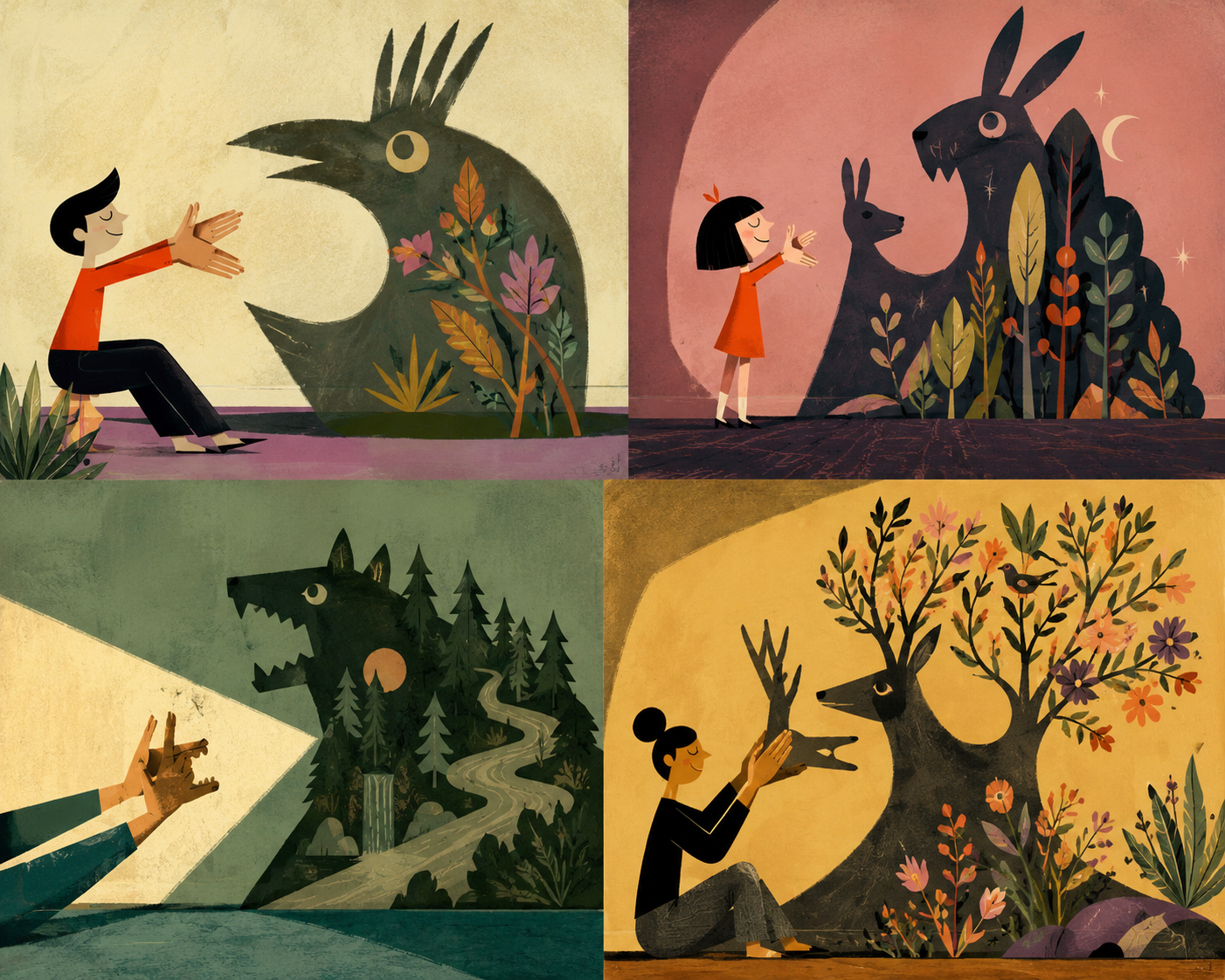
Prompt: "Alright, this is a start but I want it cropped much tighter so it's just the hands. Take a look at the attached image for inspiration. But with a single hand, like the second image. I love the visual look and complexity of the previous generations though."
Attached reference images:
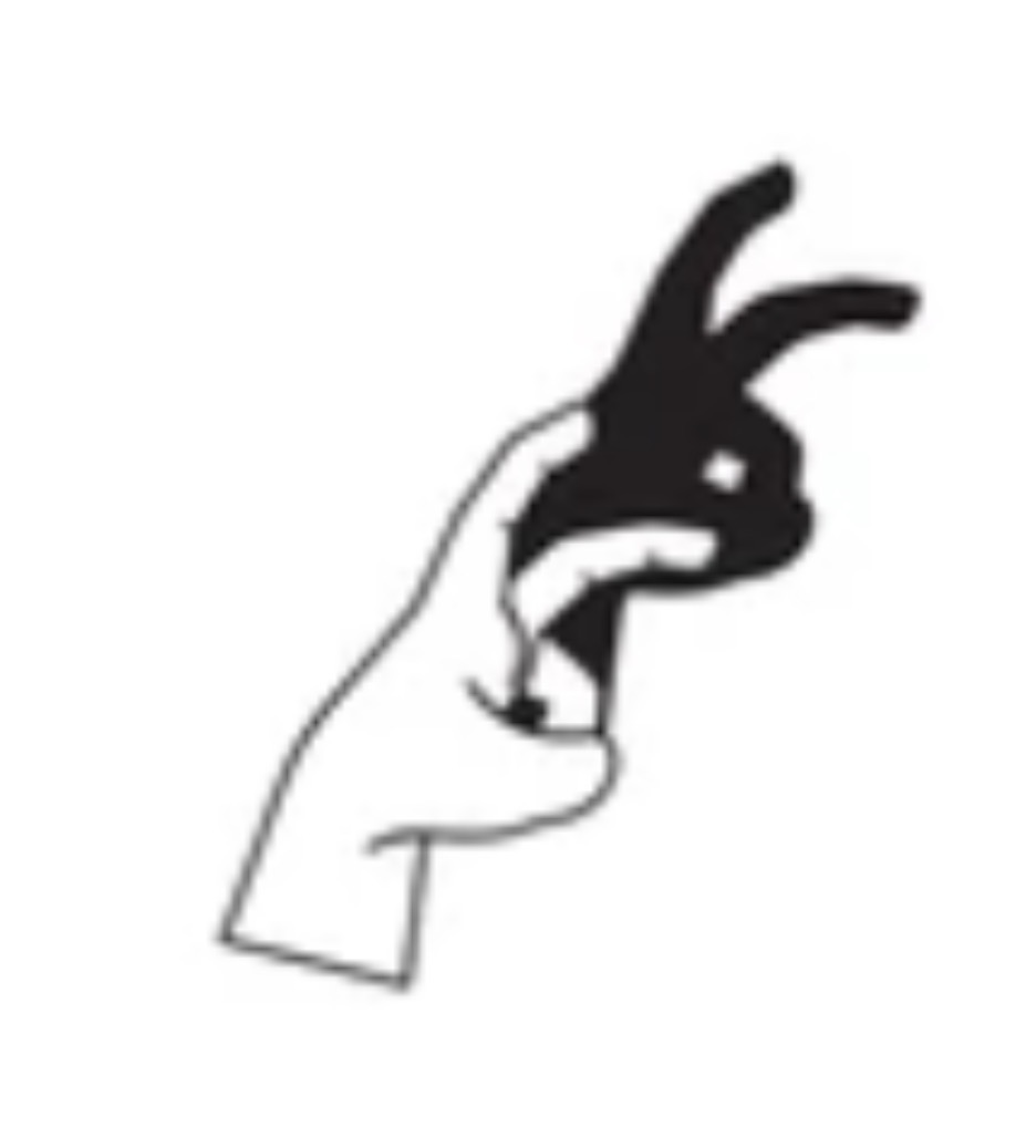
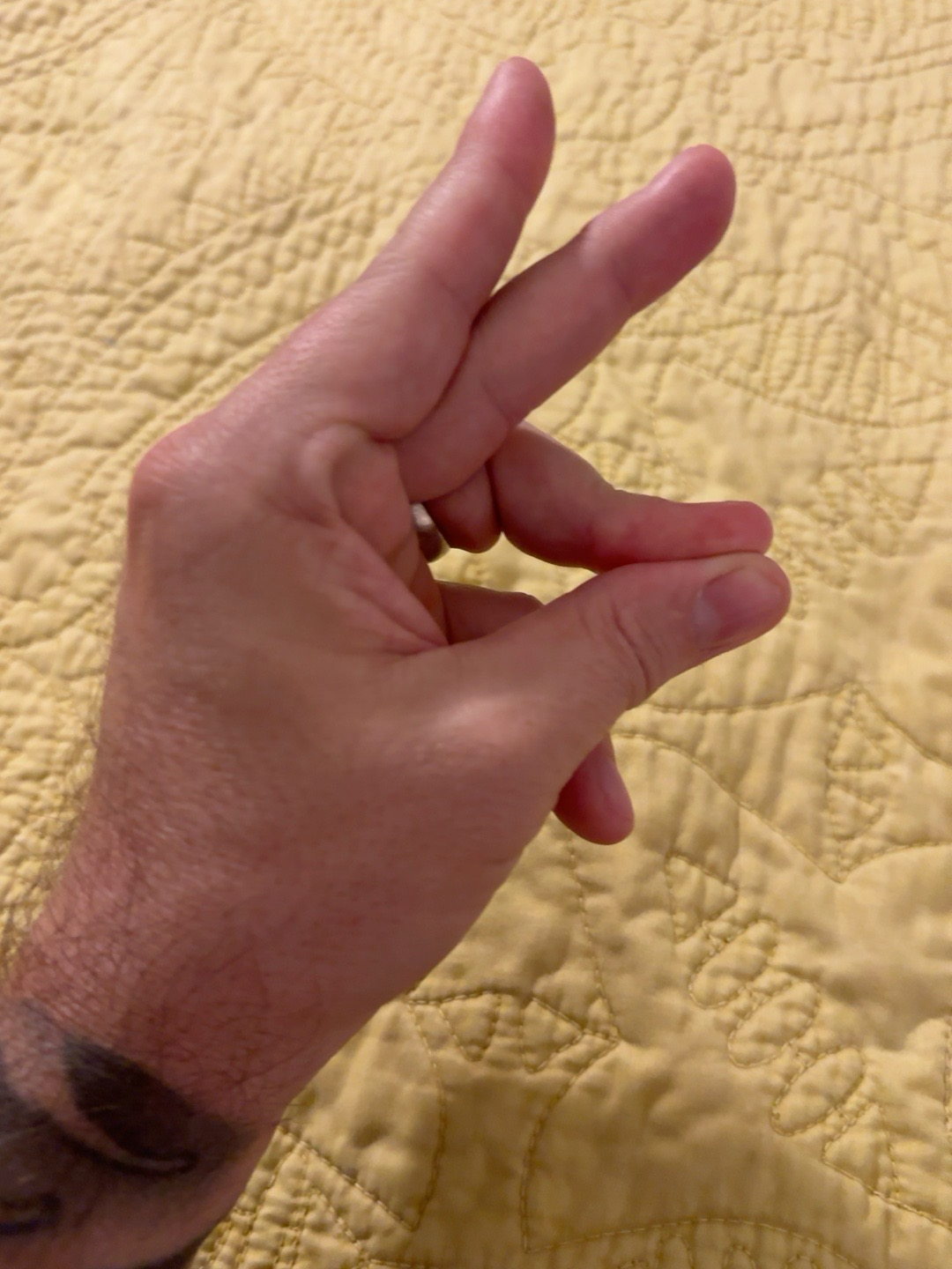
The goal was not to copy that image exactly. It was more like, this is the kind of relationship I’m talking about: hand, light, shadow, bird.
The results were great and I moved forward with the bird version.
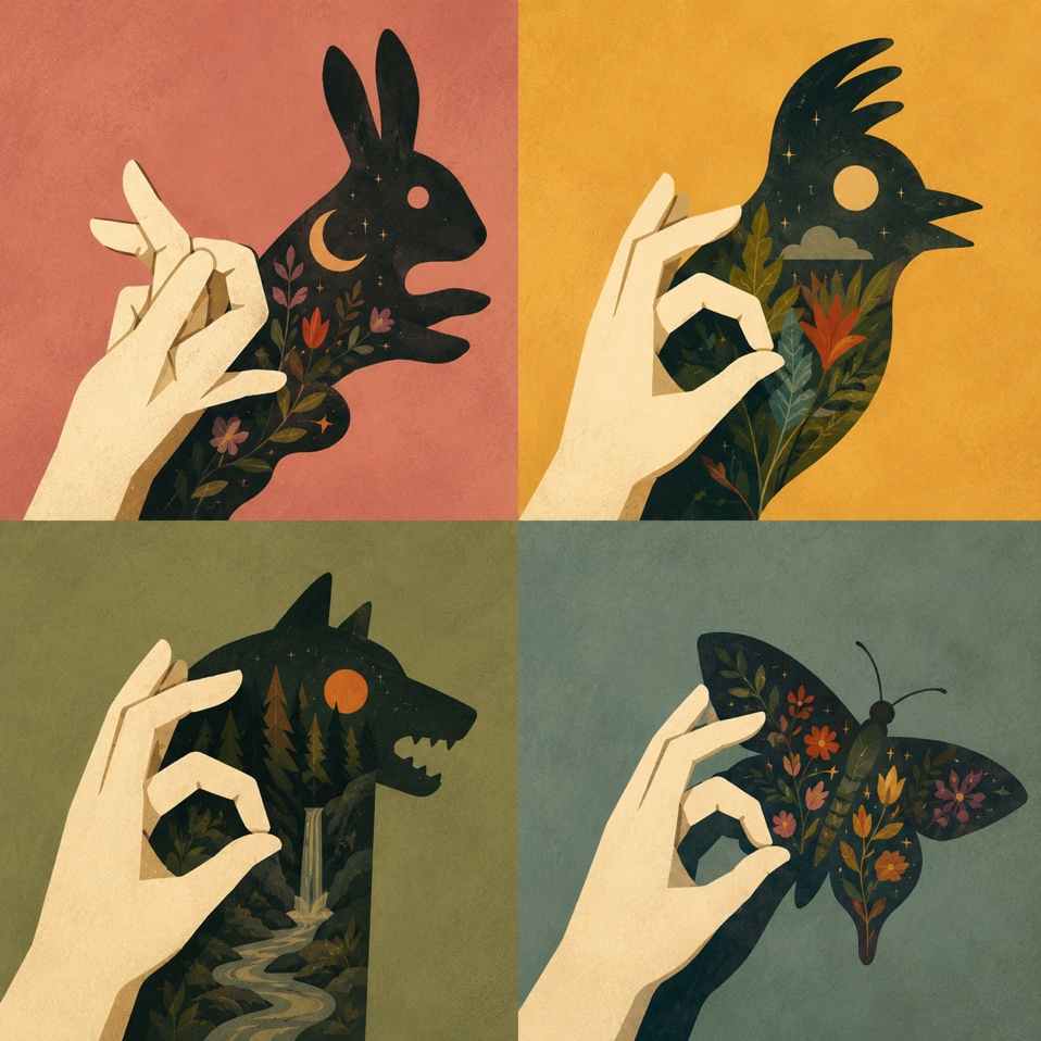
When I described the visual direction, I also said I wanted it to have a Mary Blair sort of feeling. I’m a big Disney nerd, and I love her work. I love how handmade it feels. I love the texture, the big shapes, and the way bright color can still feel warm and grounded. It is not the kind of clean modernist thing that feels like it is trying to disappear into the Paul Rand’s shadow. There’s evidence of the hand in it, feeling designed with maybe a little bit of arts-and-crafts energy.
This generated image that came out of that direction became the foundation for everything else.
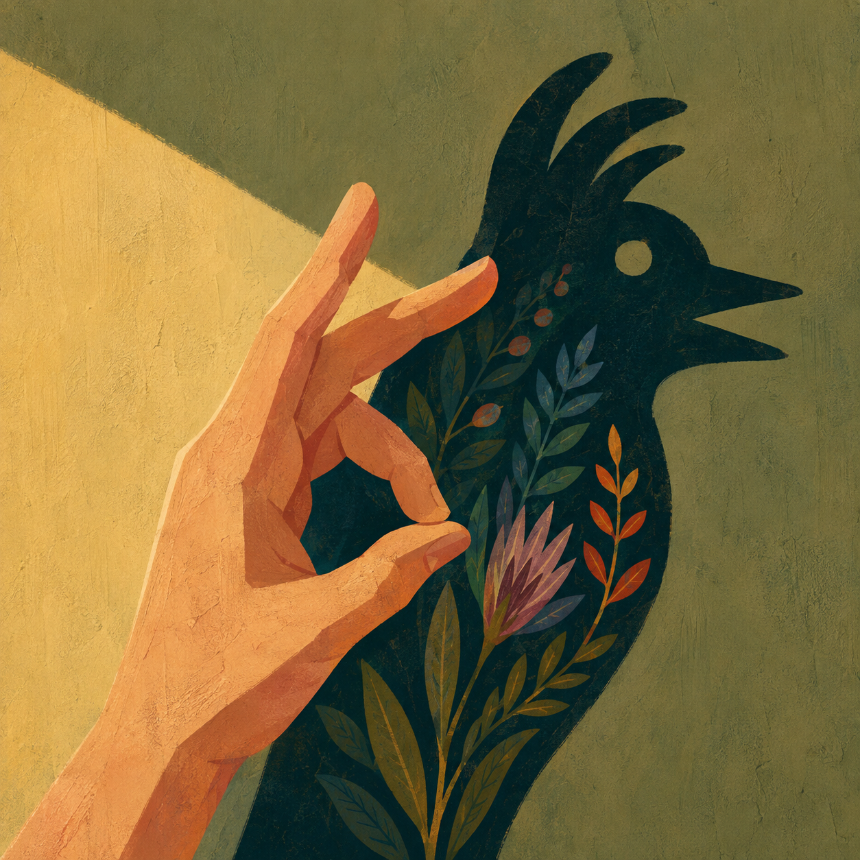
It had the hand, the light, and the bird shadow. But the part that really grabbed me was inside the bird. The shadow was filled with flowers and leaves in the original inception, but this final version really nailed the metaphor for me; like the shadow was revealing something you could only see because the hand was being blocked by the light.
All of the work above was done on my phone using my personal ChatGPT account. I stopped here because my personal account isn’t on a paid plan and I’d hit the usage limit, which took about 20 minutes.
The next morning, back on my laptop which uses my university ChatGPT account, I dove back in. From here on out I’m using Codex 5.5 medium.
Now that I had my foundation image of the bird, I started getting interested in the flowers by themselves. I asked for a 1920x1080px background that removed the hand, removed the bird, removed the green wall, and just kept that dark botanical feeling. I wanted the flowers to bloom up from the bottom of the image, almost like they were hidden in the background.
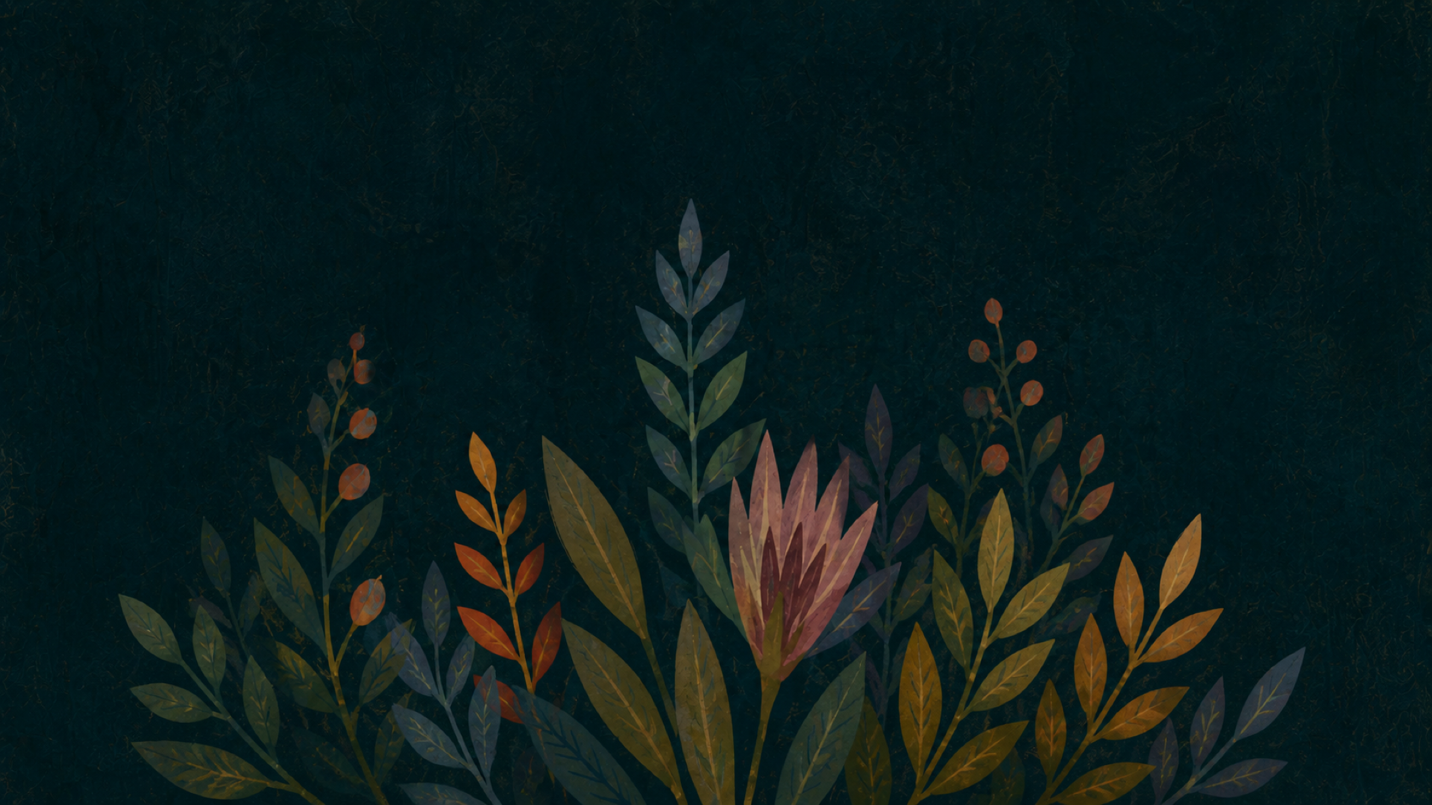
Prompt: Can you generate just, like a 1920 by 1080 background of just just the flowers? I don't want the hand, I don't want the bird, I don't want the green background. I just want the kind of the dark background for the entire image with these flowers kind of blooming out of the bottom of the image.
The first version was beautiful, but the shape was not quite right. I wanted the flowers to follow a more specific path. So I made a quick black and white image as a reference. White meant the flowers should go here. Black meant leave this empty.
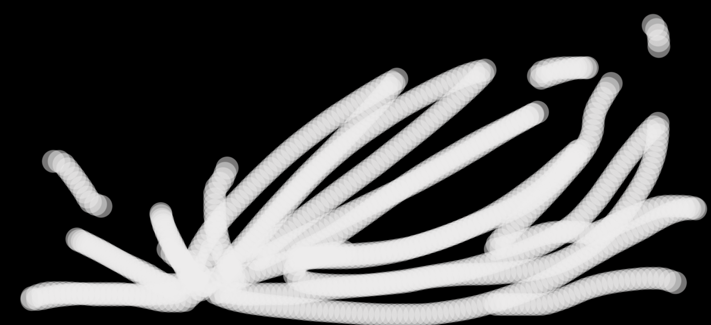
Prompt: I've uploaded a reference image that is black and white. I would like the flowers, instead of starting from the center, to kind of follow this white shape. So it looks like it is blooming from kind of the left a little bit from there, so that the flowers are growing in the shape of the white part of this composition. Still same artistic direction though, same dark background, same visual style.
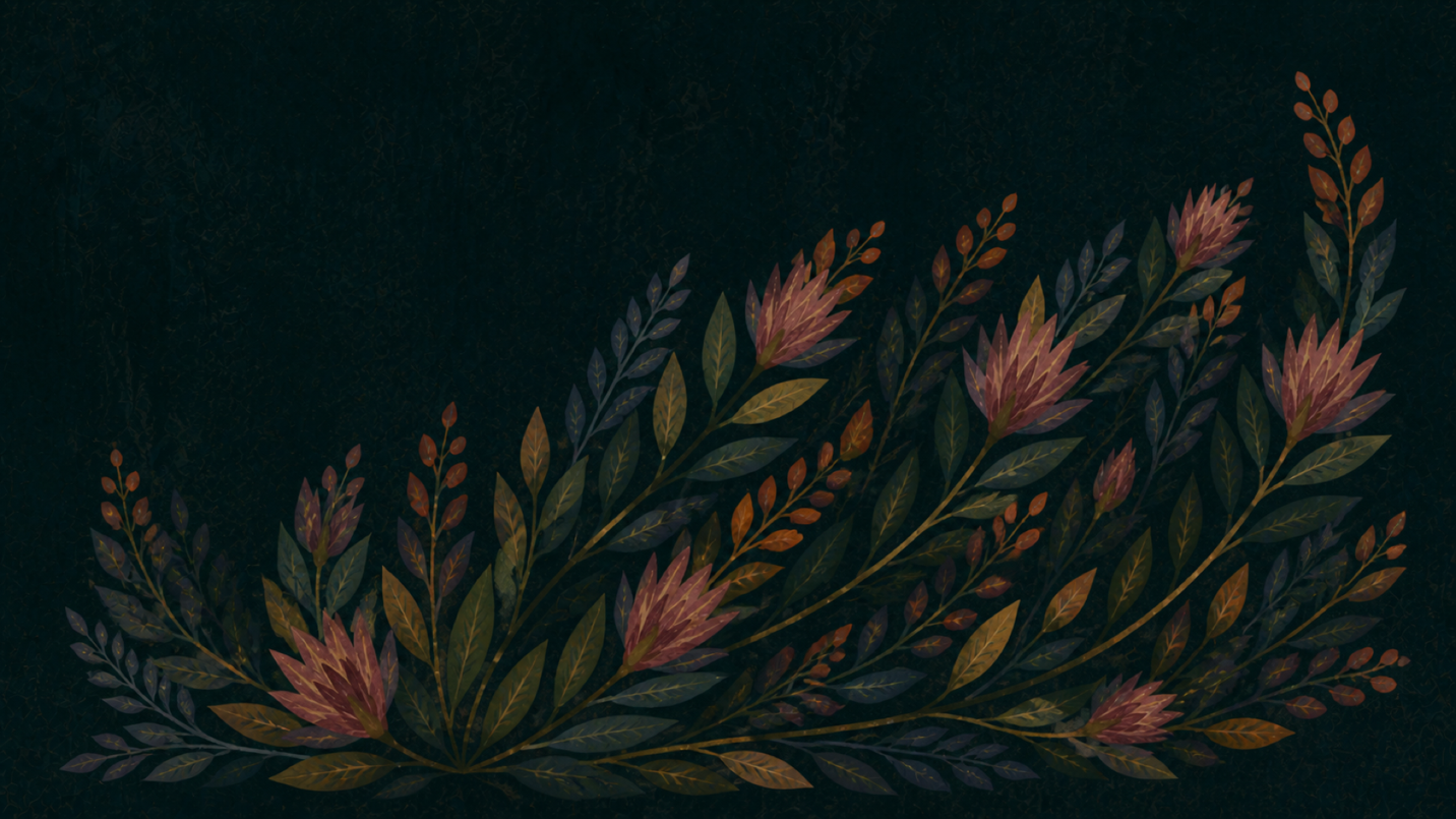
The next version followed that shape much better. It kept the same dark background and the same handmade botanical style, but now the growth had a direction to it. It felt less like decoration and more like it was moving through the space intentionally.
After that, I asked for variations.
Prompt: Can you give me three variations of this? It's almost as if there are three different seeds of this same generation. You can vary it with, if you look at the first one you generated, there are some greens and oranges in there as well. The one that you gave me now, the first one this generated one you gave me, has a lot of the orange tips, and a lot of blue. It's kind of a very blue and orange image with some red. You can vary the scale at which the flowers grow, so that maybe it is less flowers but bigger. You could vary the color. It could be, you know, just three variations.
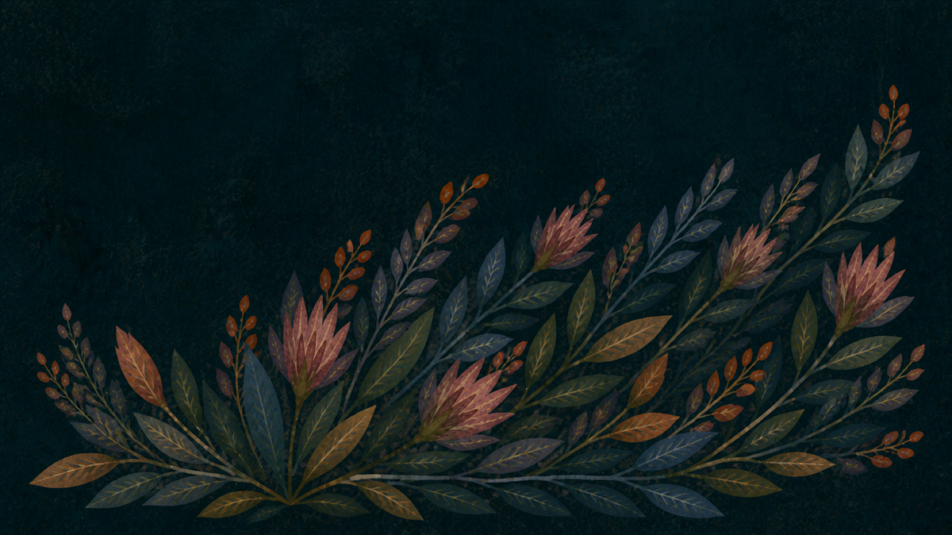
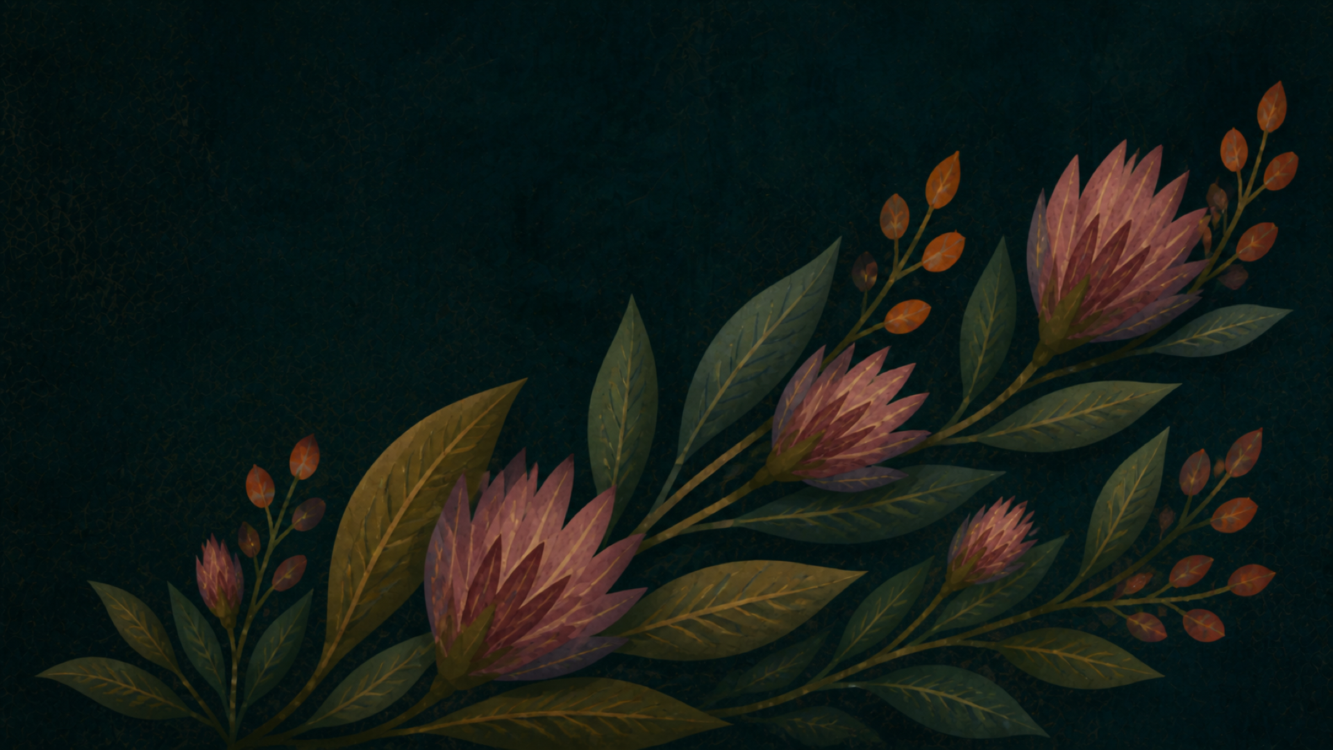
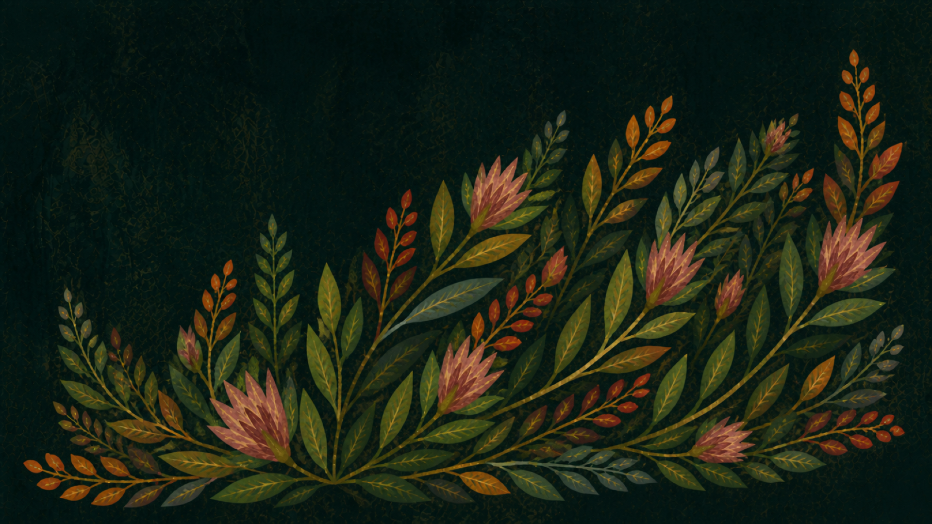
This is one of the places where AI image generation felt very useful. I like being able to get a few options quickly and then respond to them visually. It lets me say, okay, that one has the right color, that one has the right scale, that one has the right movement, but none of them are exactly it yet.
I wanted to have the flowers grow in a specific way, but I was only letting the system know part of the overall goal. I needed to give it more specific instructions, however I couldn’t quite put it into words.
The idea underneath the image
The more I worked with the flowers, the more the metaphor started to shift a little.
The shadow puppet idea was already about collaboration: a hand and a light creating a new shape. But the flowers inside the bird made me think about the possibility of the thing already being there. Like the light is not inventing the magic from nothing. It is revealing something that was already hidden in the dark.
I needed the background flowers to feel like the idea was already present before the spotlight hit the hand. The assistance reveals it, or intensifies it, or makes it visible. But the possibility is already there. The flowers are the kernel of the idea.
To figure that out, I made a quick Photoshop mockup. I layered the flowers into the darker background so they felt almost like wallpaper. Then the spotlight revealed a brighter version of that same botanical pattern. Inside the bird, the flowers became even more visible and colorful.
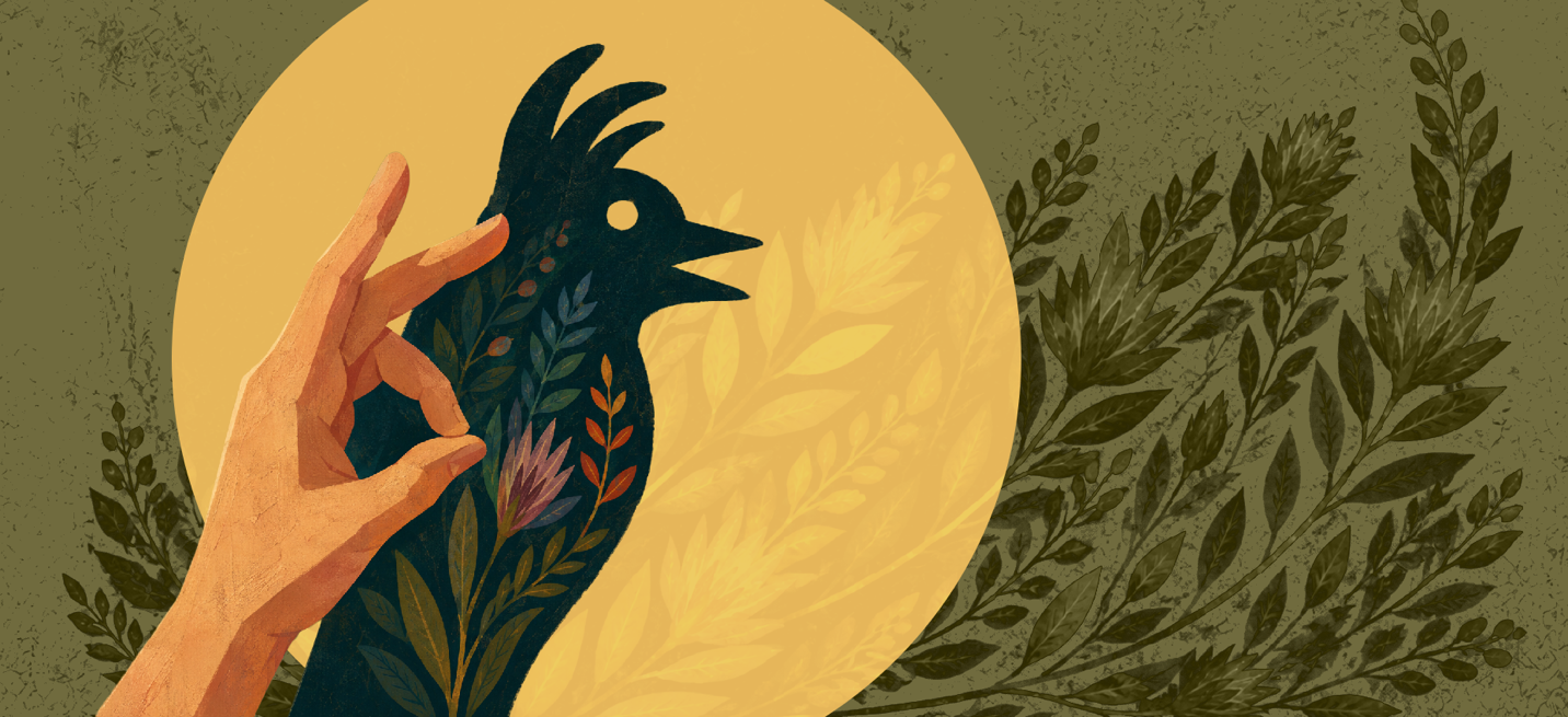
This is one of the parts of the process where Photoshop was just easier for me. I could have kept prompting for every change. Move this. Darken that. Make the flowers feel hidden. Make the spotlight reveal them. Make the background more like wallpaper. Keep it Mary Blair-esque but don’t make it too busy. That probably would have gotten somewhere eventually… and cost a lot of tokens and credits. It was faster for me to open Photoshop and try it. Move the layer. Change the opacity. Look at it. Nudge it. Decide if it felt right.
This didn’t feel separate from the AI process. It felt like part of it. The AI gave me material to work with, and then Photoshop let me think through the material more directly.
This means the workflow was not strictly AI on one side and human work on the other. It was more back and forth than that. AI, then Photoshop, then AI again, then more Photoshop, then code, then more small corrections.
Prompt: All right, so I did a quick Photoshop mockup so you can kind of see what I'm going for. I want it to look as if, you know, the idea for this image is a metaphor for the human aspect is being combined with an artificial assistance. So in this case, a light creating a shadow puppet. But with the assistance, the thing that is revealed is something bigger, greater than, and is a combination of the two, meaning the shadow that is actually formed. Now, the shadow is this bird with these flowers glowing out of it. So I want it to look like the idea of the background part, that we were just generating, is the flowers and the inside, the guts of what is revealed as the shadow, is there all the time. That it's the kernel of the idea. So even without a light, the assistance shone on the human hand, the possibility of the magical thing that you're going to create is there because it's the idea behind everything. There is a spotlight that is spotlighting the main thing that's made, but these flowers are hidden within the darker background. Now, so this is basically the composition in there, but I'm just doing this quickly, and I'm having trouble visualizing how these background flowers are going. So I'd like you to take a crack at it. Now, it doesn't have to be monochromatic in the background, but it should, like the original image that we first uploaded, have that textural, handmade, Mary Blair-esque type feel to it. So can you do kind of three versions of this so I can see how you're incorporating it?
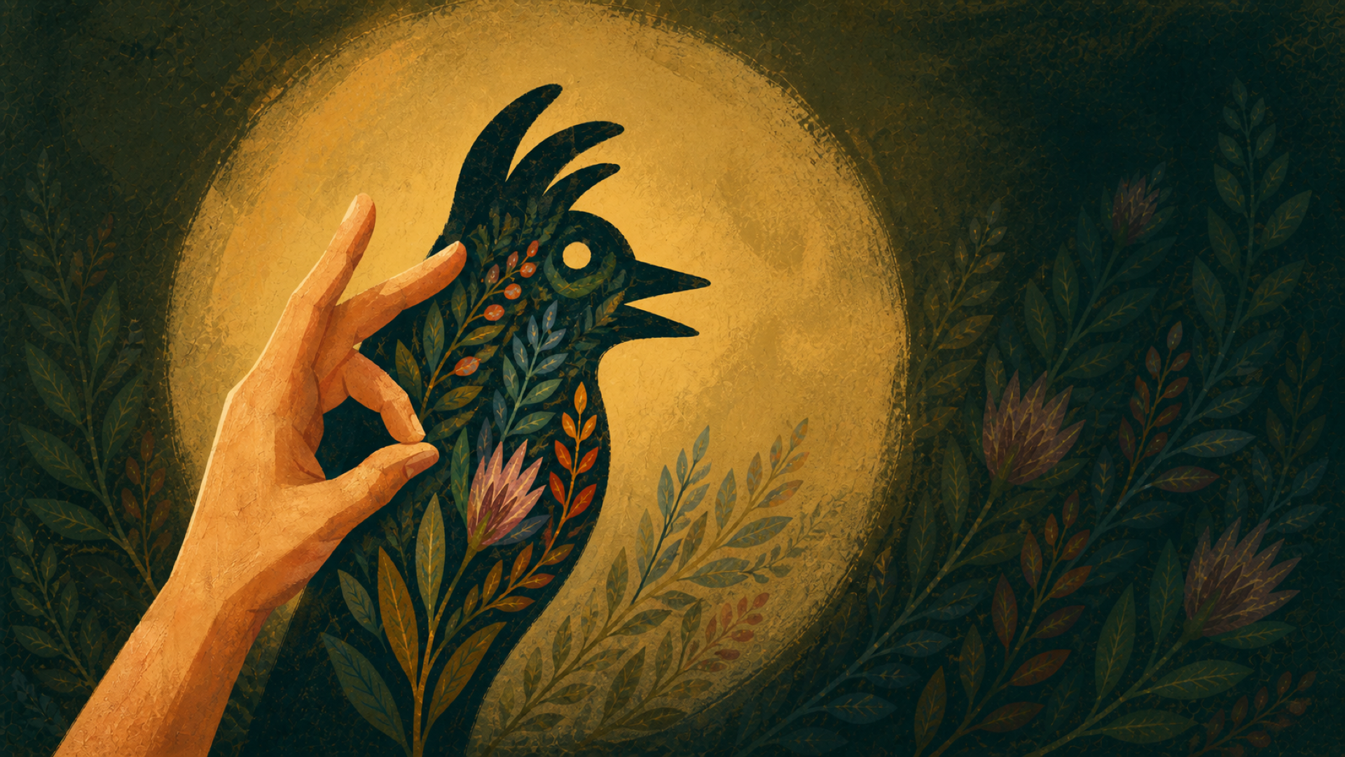
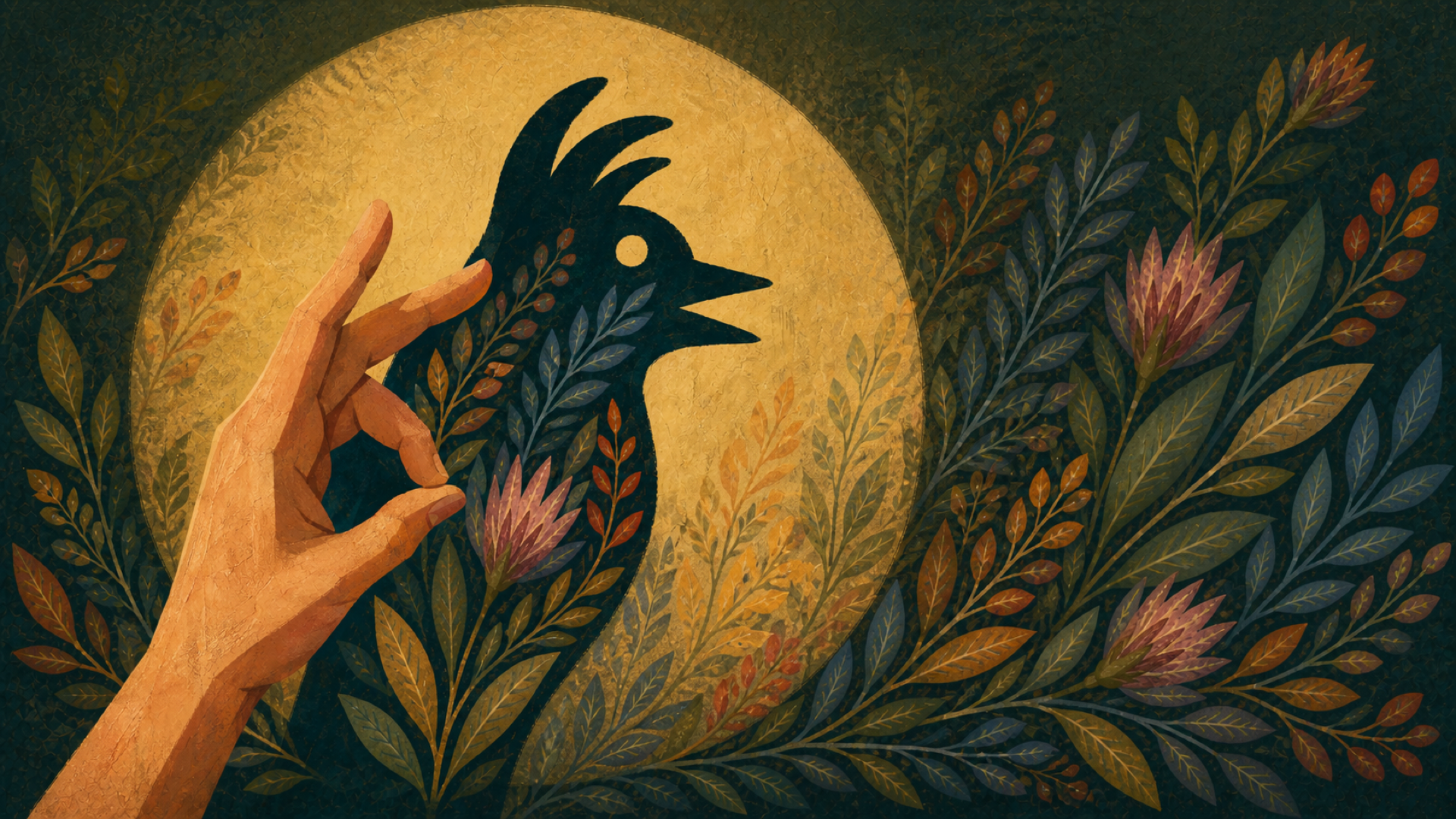
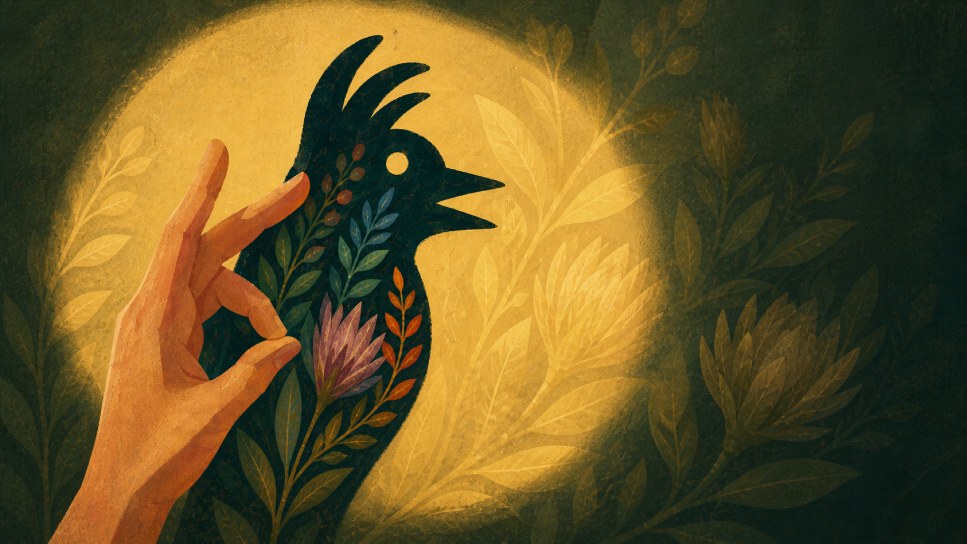
I really like the last one, but wanted to explore a bit with less texture.
Prompt: version three is nice because it almost feels like the botanicals are wallpaper, and the shadow from the light is just revealing a combination of shadow and wallpaper into something more vibrant. I really love that one. Can you do a version of number three that has no texture whatsoever and is more, more vector feeling?
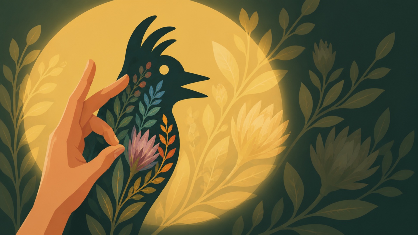
That was useful, but mostly because it showed me what I didn’t want. It got too clean. Too perfect. Too polished. It lost the slightly handmade feeling that made the first image work for me. The way AI interpreted “vector feeling” wasn’t consistent across all the elements; there are different levels of texture and detail between the internal elements. That type of internal indecisions felt unfocused and gave it a feeling of what folks consider “slop” - the result of letting the AI do too much with conflicting information. It doesn’t know what to keep or discard with an eye on whole composition.
The final step was bringing the image into Photoshop to expand the left and right side using generative fill. I also needed to add in the pinky finger; AI forgot that little guy and I figured it would be easier to do this by hand instead of figuring out the prompt which would have most likely adjusted more than that one minor part. I selected the ring finger, copied it to a new layer, scaled it down, and used a layer mask to place it behind the rest of the hand.
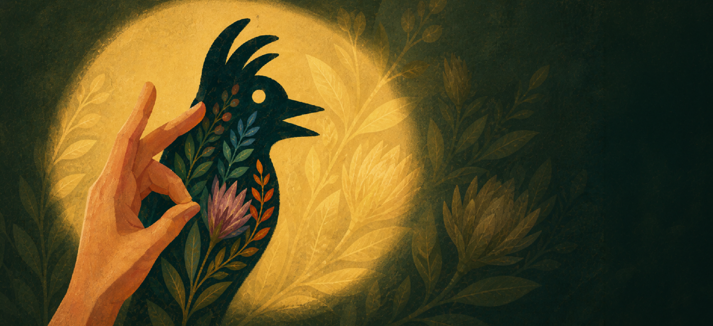
With that I had a final image! Next I’ll dive into using this image to drive the redesign of the rest of the blog.