Let's Design a Blog Together, Part 2
Part 1 started with the header image. The blog itself is already part of a larger AI-assisted workflow. I had been working through how to make a blog that would not become another thing I forget to update, because let’s be honest, I cut my teeth on never updating my Zenga, then Friendster, then MySpace, and, well… you can see the pattern, right? I wanted something low friction. If I’m already using AI to help me think through notes, drafts, and reflections, then it makes sense to also use AI to help with some of the mechanics of maintaining the site.
I went through a few mental options (Medium, Substack, even Blogger) but the automation part never clicked. Then the almighty algorithm delivered a post about Jekyll, a static site generator that could easily be pushed to GitHub. This basically means the site is built from plain files and templates instead of me having to manage a database or a bigger publishing system. That felt like the right level of simple for this project, even if I still don’t understand every piece of the workflow perfectly.
And I definitely don’t.
I still don’t fully understand the split between the quick local version we were using for design work and the Jekyll version that actually gets pushed to my Git repo. I know one is a production sandbox, and the other is the version that goes live, but sometimes it gets confusing knowing which one I’m working on. And I still don’t manually push things to Git from memory. Right now, I’m content to simply prompt “push that” and see this agentic workflow in action. I know I can learn all this, and I probably will at some point, but right now it is not the biggest thing I want to spend my energy on.
What I do need is enough understanding to ask better questions. That has been one of the more useful parts of this whole process. I might not know the exact technical term for what is happening, but I can usually tell, or feel, when something is wrong. Then I can ask a more specific question.
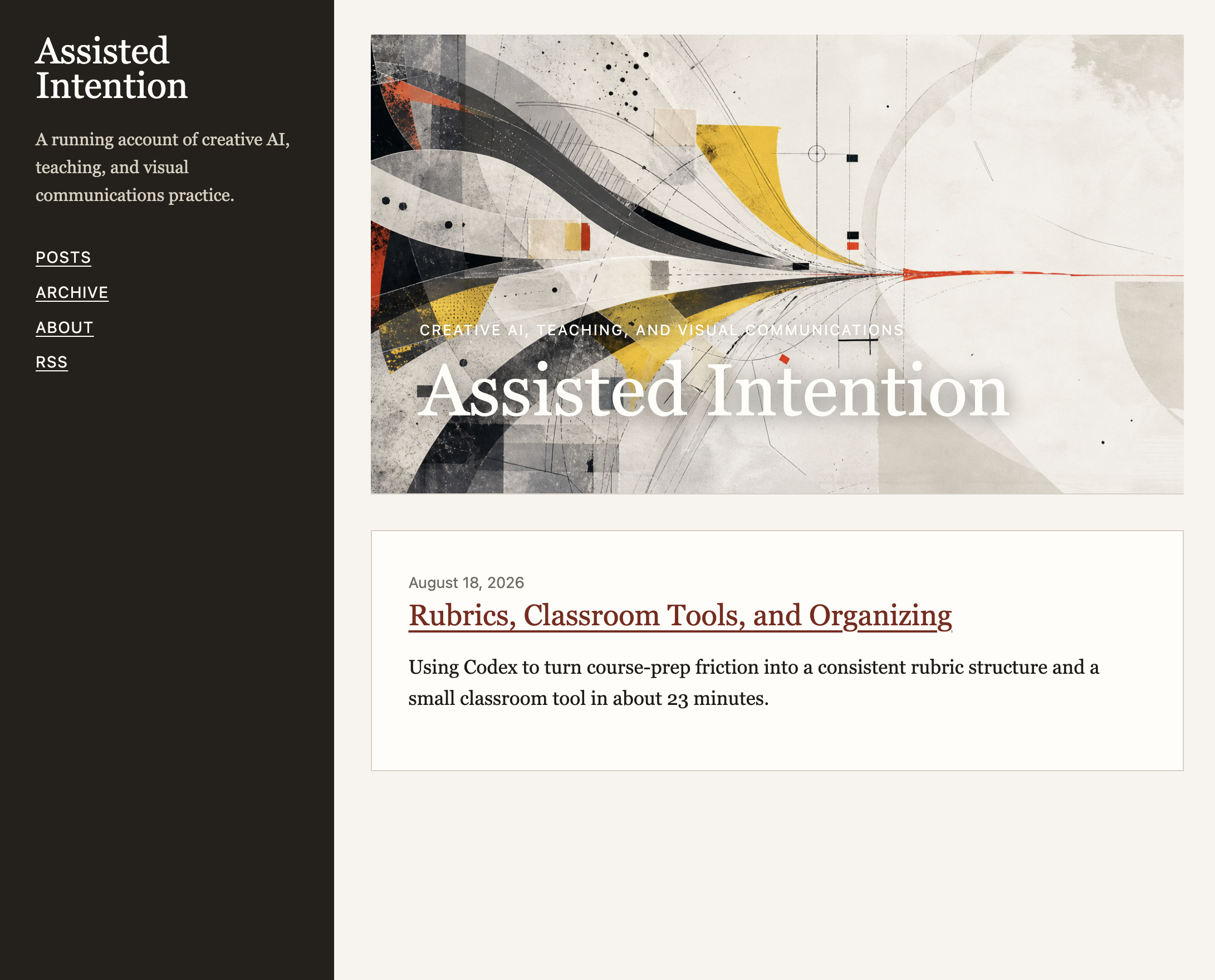
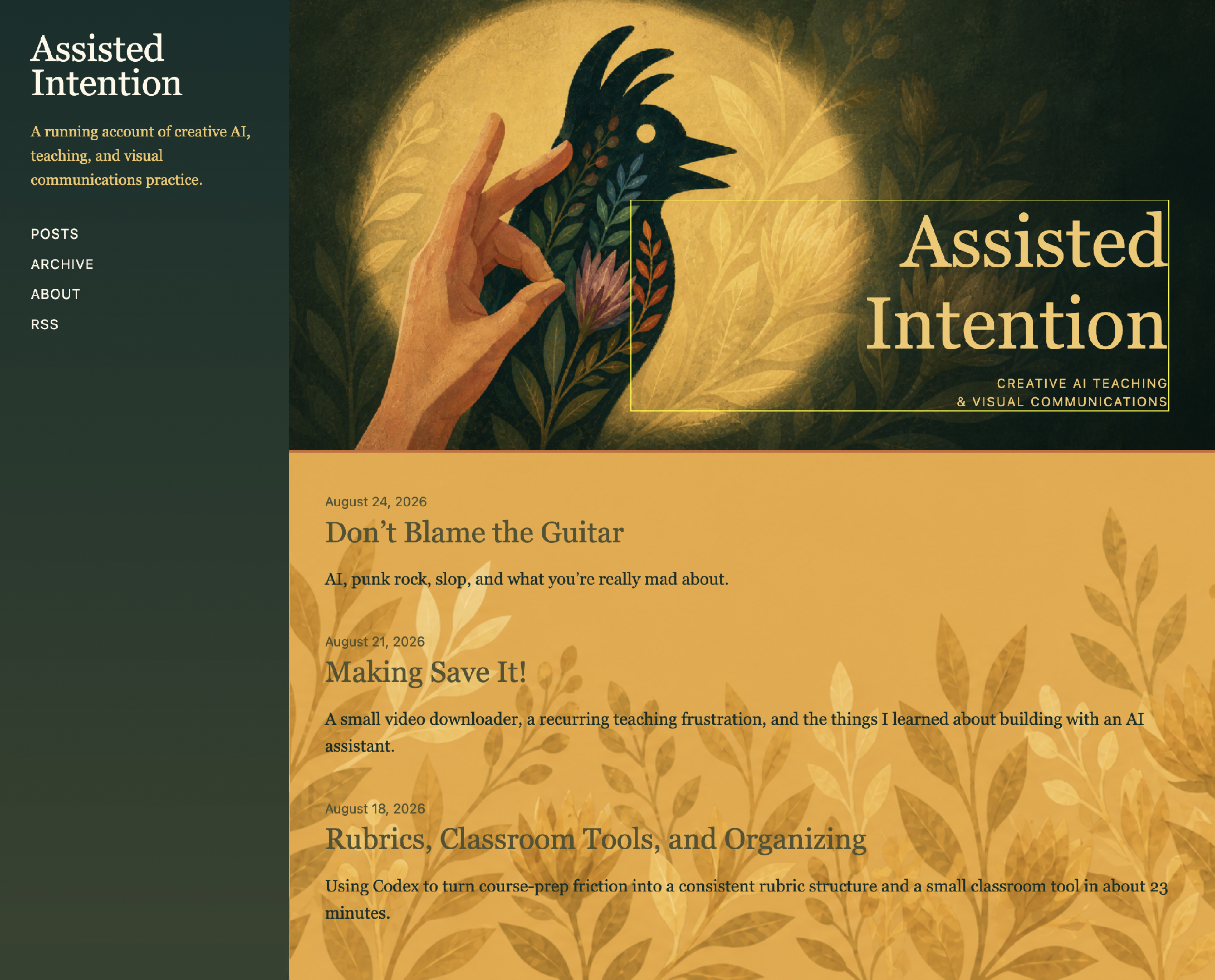
Once I had the header image designed (the previous one was randomly generated placeholder), I asked Codex to pull a color palette from it and apply it to the site.
A consistent pattern I’ve noticed from basic vibe-coded sites is the number of boxes everything gets put in. You’ve seen this before: put each thing in a card, give it a background, separate everything into little containers. This is a web design habit born from the need for visual separation in our minimal/flat UI layouts… and, dare I say, people making layouts without understanding how contrast, scale, and white space play a more elegant and less obvious way of visually grouping and separating things. Personally, I hate all the boxes. It’s a bevel training wheels pattern that needs to be scraped off.
In addition to removing boxes, I wanted to bring the botanicals from the header into the rest of the layout. The native layout for the Jekyll site had a left-hand sidebar, and I liked the idea of using the green botanical pattern there, almost like a wallpaper strip. We generated a tall image where the flowers grew down from the upper right side.
Prompt: alright, based on the background layout for this, I love the wallpaper look, and I'd like to incorporate that in other elements throughout my site. So, I was thinking because the site itself has that left-hand toolbar, that maybe the subtle wallpaper of the green background could be on there. Now I'm not sure. Obviously I can't, because the background on the header has a texture to it. I would either need to add a subtle repeating texture to that green space, or use just the flowers with the texture on just the flower illustration. The key here, though, is that it should just be on the green. So, imagine a tall vertical image where a flower is sprouting from the upper right-hand corner down the narrow vertical side. Can you make that?
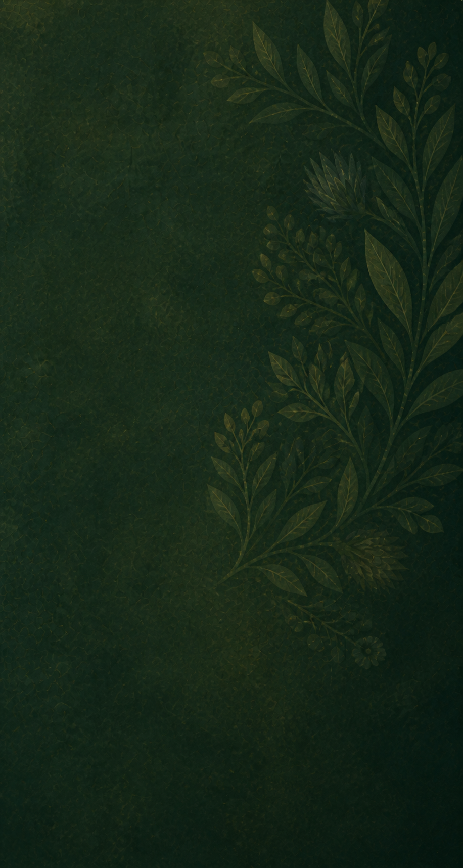

I also added a yellow version for the bottom of the posts section. It was nice, and I could imagine it working, but the layout still felt too boxed in. So, we removed the boxes and let the text sit directly on the paper background. That made the site feel more open and more like a page. It also fit the idea of the project better. If the whole point is to make the process visible and not hide everything behind a door, then the writing probably should not feel trapped inside little containers either.
Prompt: Can we remove those white boxes and let the text just sit on the background? This might be as simple as just turning the box's background to have a zero transparency. And then the header image, can we expand it so there's no margin around the top, left, and right, so it hits the edge of the browser? That it's flush right up to it.
And then, let's put the subheadline in the header, that Creative AI, Teaching, and Visual Communications. Let's put that under the word Assisted Intention, and let's break it up so that Creative AI, Teaching is on one line and then an ampersand and Visual Communications is on the second line. It'll fit better under the dark right-hand side of the header.
This worked, but I could already see the tedium of giving it one verbal instruction at a time while I was working through layout decisions in real time. Plus, I was getting close to my 5-hour usage limit (another fun limitation I keep running into), so it was time to organize my thoughts in a more analog way. I’m alright with some basic HTML and CSS, so I figured if I knew where to look, I could figure it out.
Prompt: is there somewhere I can update things manually just to play around with colors? it's quicker if I can just play around than prompting right now.
This was an immediate mistake and a quick confrontation that I was in over my head. The code was beyond my knowledge, and even when I asked Codex to point me to the places I could update, I was introduced to the sandbox/production versions of the website. The two versions of the site weren’t immediately obvious, so I struggled for a bit going back and forth with Codex trying to figure out why a simple CSS border wasn’t showing up.
After some back and forth (and wasted tokens), we were on the same page. The issue is that the sandbox/production version of web projects is standard industry practice. However, when I’m just coding on my own, I just skip that. And honestly, it had been nearly a decade since I was working on a project that required this; and even then I was art directing and my developer was just making changes, not bothering me with mundane details like this. That was their world. And so, I had to unpack this developer instrument that was now part of my one-man-band ensemble and learn a little bit of how to play before moving forward.
This was not meaningful friction. This was just irritating friction.
So, for a little while, we shifted how we were previewing the design so I could make small changes faster. I continued testing typefaces and colors through dictation and eventually got fed up. I can do this so much faster outside of Codex. That was a good reminder that part of the workflow is figuring out which friction is worth keeping and which friction is just slowing everything down.
I took a screengrab of the site at this point and got to work in Photoshop. Twenty minutes later I had tested all the font, color, and layout variables I wanted to explore and had a simple mockup.
The Photoshop mockup that helped everything click
That made a huge difference.
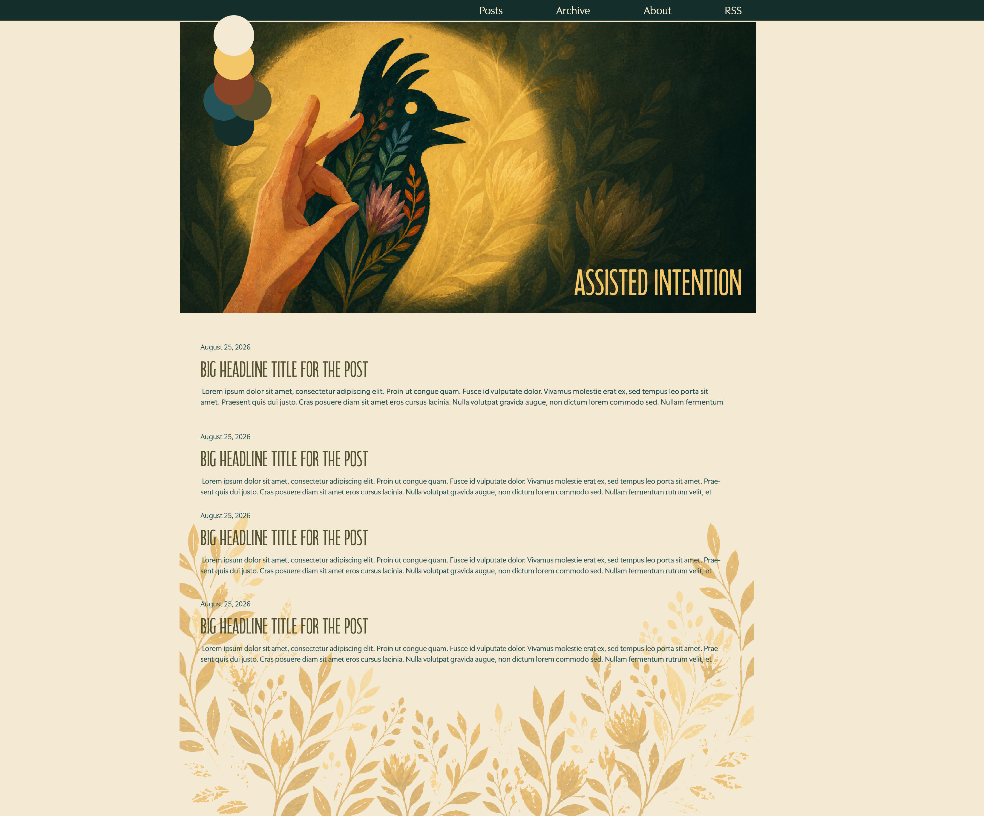
Instead of only describing the layout, I could show it. I removed the left sidebar. Moved the navigation. Centered to a single-column layout. Finalized typefaces and simplified the color palette. The color palette was interesting because the one Codex chose had nice visual contrast, however it completely ignored the color value contrast. That type of contrast is standard for UI, but unlike the standard of the sandbox/production sites, Codex was unaware. Obviously I know it can code like a champ, and I know it knows the rules of design… but why not this one?
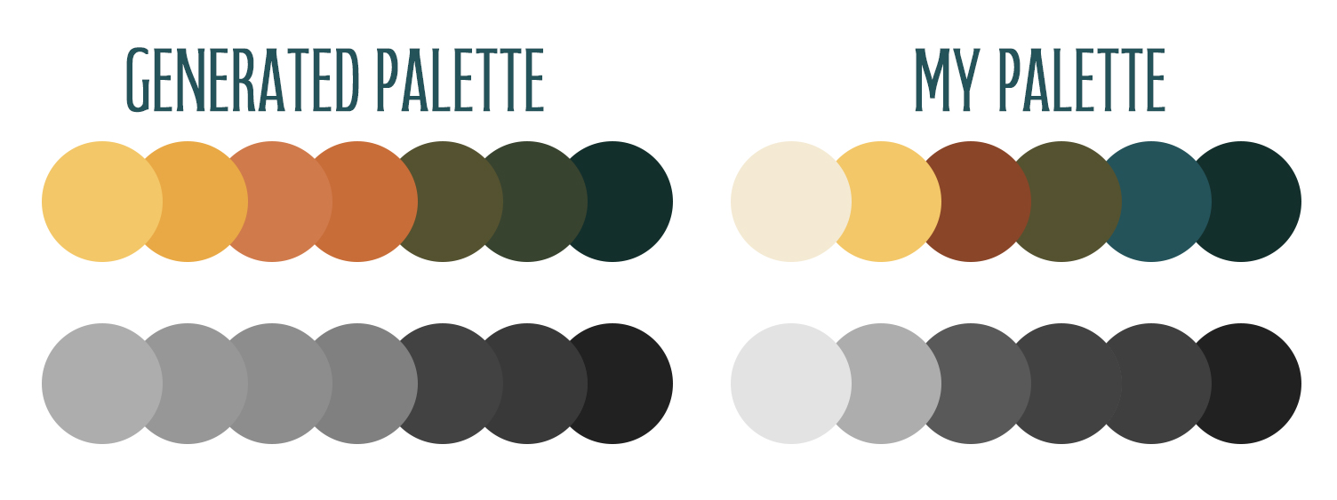
I then uploaded the mockup along with a detailed description of what I wanted.
Prompt: alright, some other big changes are as follows — All right, I'm going to upload an image for you as guidance, style-wise. But here are the big changes. So from a layout perspective, we're going to get rid of that left-hand sidebar. This is going to be a center, single-column scrolling website, kind of similar to the JasonTeaches.com website. This means I'm going to be moving the navigation, the post, archive, about, and RSS, to the top with the dark, the darkish bluish color as the bar across the top, and the words Post, Archive, About, and RSS are going to be in the light kind of paper white color. Those are going to be in the body copy typeface. Then you've got the assisted intention image underneath that, and the words assisted intention will be written out on one line in the main headline typeface. This will be in the yellow color, and this will be bottom right aligned. The entire background for the site is going to be the paper color. And then the headline, or the blog posts, like the blurbs for them, the date, and the body copy are going to be the body copy typeface, and they are going to have 1.5 times line height to the normal size, so there's more space on the line height. The headline title for the posts— oh sorry, the body copy is going to be the lighter blue. The headline for the posts will be the olive green color, and those will be fairly tall, probably about, well, in Photoshop it's 72 point, but I don't know what that translates to on web. Now, this means I'm getting rid of, on the left-hand side, the name of the website and the title saying A running account of creative AI teaching visual communication practice. The headline underneath the subhead underneath the headline that says Assisted Intention over the header image, we can still keep that, Creative AI, comma, Teaching and Visual Communications. We'll have that be one line fitting underneath Assisted Intentions, and that'll be in the body copy size. Now the leaf image that is on the bottom, the flowery image, we're going to have to redo that, but we'll save that for a second time later. So I'm going to upload this image, and we're going to go from there.
And that worked like magic; Codex got it perfect on the first try.
This was something I had already learned while making the Save It! app. If I give a mockup, the result gets closer. If I only describe something, there is more room for interpretation. Sometimes that interpretation is useful early in the process, but once I know what I want, the mockup matters.
The bottom flowers
Once the main layout was working, I came back to the flowers at the bottom of the page.
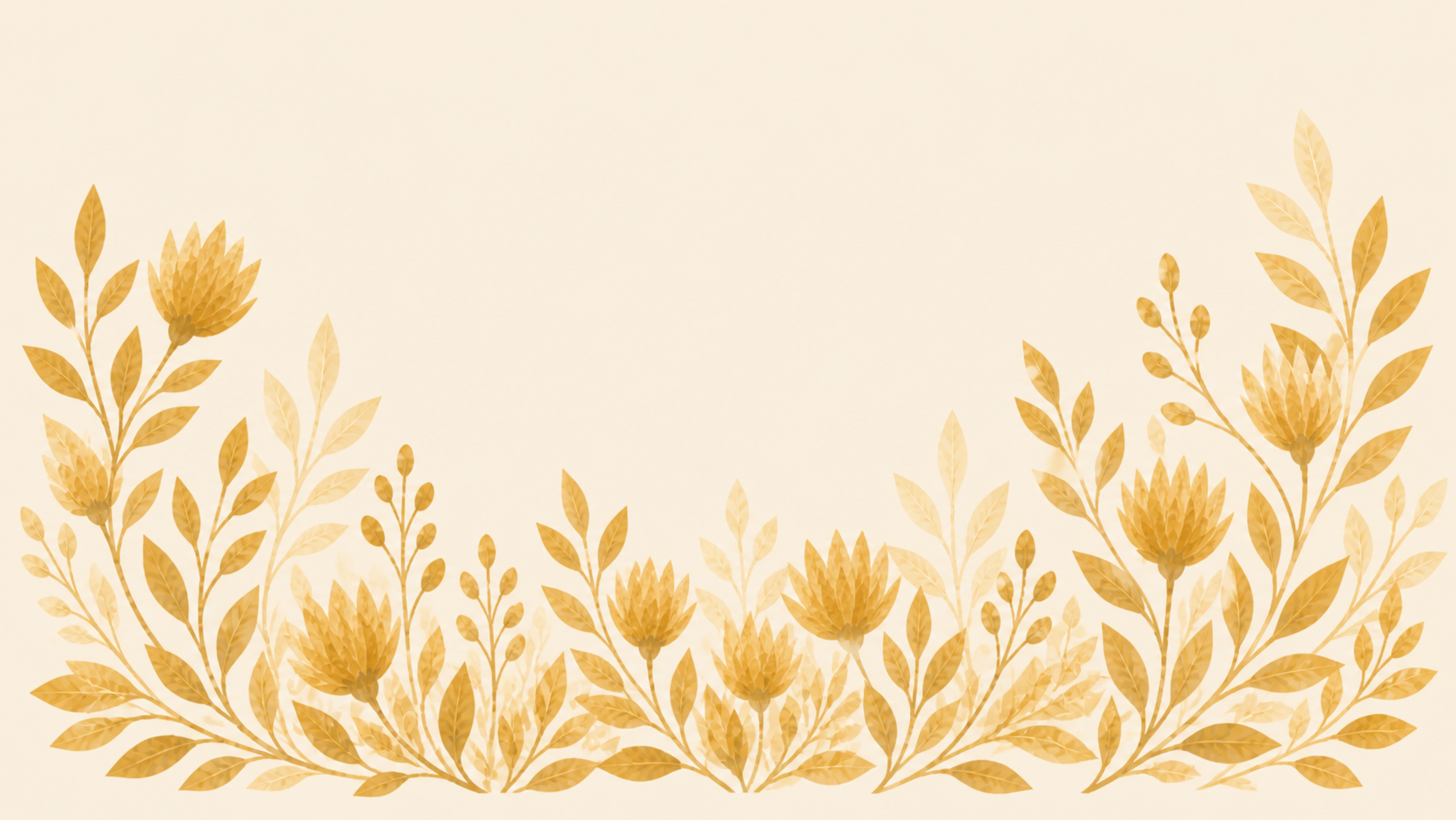
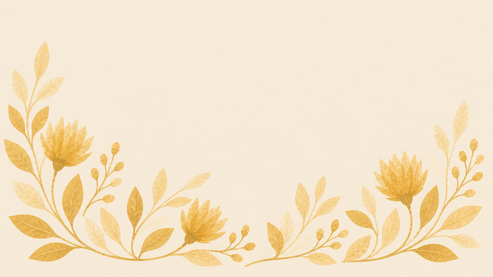
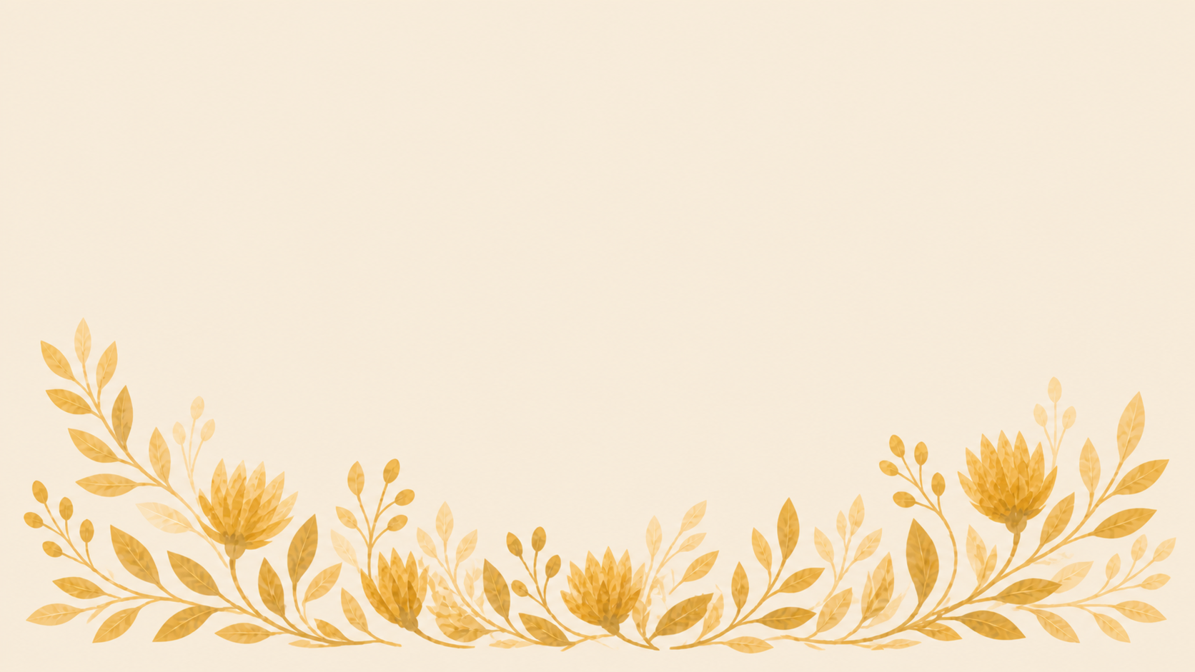
I wanted something that grew up from the bottom center and along the left and right sides, almost like the page had this quiet botanical base. That first version before the Photoshop mockup used a yellow background, and as an image by itself, it looked beautiful. But once it was placed on the site, the background color did not quite match the paper color of the page. It was really close, but for some reason Codex just couldn’t match the colors, which meant a visible edge where the image started was visible.
I’m not sure why this was. It had the color palette. I suspect the flower image is a raster-based approximation done through the image model while the background of the site is code; the two sides just aren’t talking to each other while the agents are putting them together. Manually this would’ve been a quick eyedropper color selection fix in Photoshop, but I opted to just have it make the flowers transparent, so the actual site background color could show through. The flowers could still keep their texture, but the page itself would stay one consistent paper color.
It looked great, so I asked for five variations.
I liked the idea that individual blog posts could randomly use one of the five bottom flower images. It is a tiny detail, but it makes the site feel a little less static. The homepage can have one version, and individual posts can quietly vary. The kind of small thing I love; a feature no one will notice or need to understand, but it just changes the feeling a little.
A lot of the final design work was small (consistent alignment and sizing, a mobile version, hamburger menu, scaling issues), and that is probably worth saying out loud. It’s the same with any project: that last 5% takes 95% of the time.
The generated output is not the design. The design is in all of those little decisions after the first version appears.
This is one of the things I think gets flattened when people talk about AI making a website. The first version is not the whole thing. The generated output is not the design. The design is in all of those little decisions after the first version appears. It’s saying, yes, no, this is close, but this one part is bothering me, until I’m happy with every pixel.
That’s where taste comes in.
What I let AI handle, and what I wanted to touch myself
One thing this process helped clarify is that I am pretty comfortable letting AI handle certain kinds of work.
I am fine with using it for variations. I am fine with using it for image exploration. I am fine with asking it to make PNGs, wire things into a site, find where a CSS behavior is coming from, or make a bunch of small implementation changes. Those are places where the speed is useful.
But there are other places where I still want to be more hands-on.
Photoshop was easier when I wanted to compare typefaces, move things around, adjust colors, fix the hand, or just play. I did not want to describe every little visual move. I wanted to try things and react to them directly.
That feels like a personal preference, but it is also part of the larger question for me. Where do I want AI to speed things up, and where do I want to slow down? Where is the friction useful because it gives me time to think? Where is it pointless because it is just making me wait?
I don’t think there is one answer to that. It depends on the project and probably on the person. But for this project, the workflow got better when I stopped thinking of it as AI either doing the work or me doing the work. It was more like figuring out which part of the process each tool was good for.
Sometimes I wanted the AI to move fast. Sometimes I wanted it to explain something. Sometimes I wanted it to make five versions. Sometimes I wanted it to stop and push pixels myself.
What I am thinking about now
So I don’t know if this is exactly a “here’s what I learned” section. It is more like, here’s what I’m thinking about after the process.
First, this went a lot more smoothly than some earlier AI-assisted projects I’ve done. There were fewer moments where I was looking at the screen thinking, what the hell happened? Some of that is probably because the tools are getting better, but I think some of it is also because I’m getting better at asking.
I’m getting better at knowing when to give a visual reference, when to make a quick mockup, when to ask for variations, when to ask for an exact implementation, and when to ask, okay, which number controls this part?
I’m also getting better at asking questions about things I don’t fully understand. I still don’t fully understand every part of the local site versus the Jekyll site. I still don’t manually push to GitHub from memory. I still run into code that is more advanced than what I would have written myself. But I’m getting better at finding my way into it.
That matters for teaching because I don’t want students to think the goal is to hide the messy middle. I want the process visible. The rough sketch. The reference image. The prompt drift. The Photoshop fix. The CSS confusion. The part where I changed my mind. The part where the tool was helpful. The part where it was annoying. All of it.
That’s how we learn, right? Fall and pick yourself up again. You see the recipe, and then you can start changing it. You see where someone made a decision, and then you can decide whether you would have made the same one.
The other thing I keep thinking about is ownership.
We talk about ownership all the time with AI, and I get why. It’s a real question. But during this project, I didn’t feel like I disappeared from the work. I felt more like a creative director.
I had the idea. I pointed my finger. I drew some shitty sketches. I brought in references. I watched something come back, critiqued it, said, no, not that shape. More like this. Keep the texture. Make it less polished. Move the navigation. Get rid of the boxes. Make this title red here, but not over there.
That’s not the same as painting every flower myself or writing every line of code from scratch. I know that. But I also don’t think that automatically means I have no authorship in the thing.
We’re used to creative direction in other collaborative work. We can talk about a movie as Christopher Nolan’s movie even though he was not holding the camera, acting every role, mixing the sound, designing the costumes, building the sets, or drawing every storyboard. There are all kinds of people helping make that final object, and we still understand the director as the person shaping the vision.
With AI, I think we’re uncomfortable with that comparison. Maybe because the collaborator isn’t a person. Maybe because AI is tied up with much bigger questions about labor, originality, training data, ownership, corporations, and power. I don’t want to brush that aside or pretend it is simple.
But the presence of AI doesn’t automatically put me in the passenger seat.
There’s a preciousness around handmade work that I understand. I feel it too. I love making things with my hands — and mouse. It’s not a zero-sum game; one doesn’t negate the other. I wanted this whole design to feel handmade. I pushed away from the version that was too clean and too perfect because it lost the human wobble I wanted — in the exact same way I would’ve without AI.
But I know if some of that preciousness is a gut reaction to something larger than the actual object in front of us.
So that’s where I’m sitting right now. Direction matters, taste matters, critique matters, and knowing when to ask for another version or stopping to slow down matters. That’s probably where I felt most present in this project: in the decisions around the thing, not necessarily in every individual mark or line of code.
The phrase I keep coming back to after this process is meaningful friction. I don’t mean just that the tool is annoying and everything is a hassle, although, sure, that definitely happened. I mean the places where slowing down actually mattered.
The change in movement through the process mattered. Different muscles produce different results. But that’s another thought to rattle around with for another time.